Pie Charts and Side Bar
Hi Dribbblers! 🏀
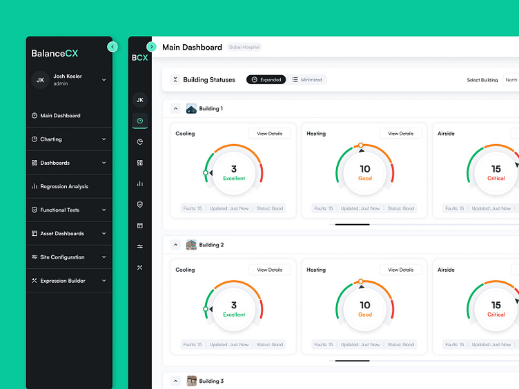
We want to share with you the screen of the BalanceCX application, where key system indicators are presented: Cooling, Heating, Airside. Circular charts are used on this screen for a visual representation of the data. Our cloud-based analytics software is specifically designed to assess system performance during the commissioning of buildings and structures, as well as to enhance the ongoing operation of the facility.
Learn more about BalanceCX in our Case Study
If you what to start a project, contact us via hello@equal.design