Day 14: Back to Basics

This is Day Fourteen of Thirty Days of Logos, in which I share a new logo idea for my design studio, Wildfire Studios, every day for 30 days.
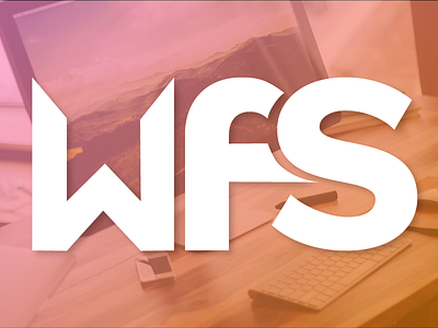
Today I'm stripping back to basics. Yesterday's logo was the evolution of a stylized look that I don't believe best represents my brand. I want my brand to not just appear friendly and inviting, but to look smart and thoughtful as well. I want it to have an air of intelligence and elegance to it.
The typeface is Quarto by Hoefler and Co., which I'm also using on my website and really like. The biggest issue with this logo is placement: it is nearly impossible to make a W feel aligned with content around it; its optical alignment is way off. So that's an area that needs definite improvement.
What do you think of this direction, particularly compared to Day 13?