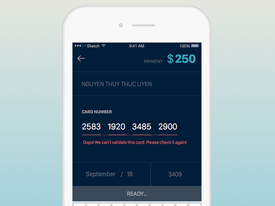
DailyUI 002: Card Checkout
*In an error state
*I intentionally designed with the keyboard because in my concept, it's supposed to be the 2nd step of payment procedure that requires input. That's while the keyboard remains position.
*The idea is to try to reduce text appear on the screen, the secondary information only appear when a section is focused, otherwise, only input information appear.
More by Thuc Uyen Hime View profile
Like
