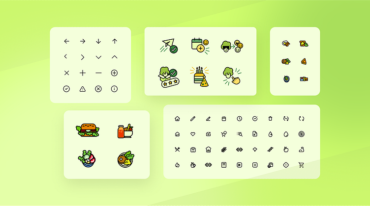
Custom icons for meal delivery diet app
Goal: Custom icon set design
The goal was to create a custom set of icons for one of the biggest meal delivery diet company, which brand is characterized by vibrant, friendly, and health oriented elements. The icon set had to serve different purposes, such as improving user navigation in the app and promotion of various meal types, preferences and categories.
Grid & Safe Area: Consistent and clean design
We design icons on a grid with safe areas, which is vital for visual consistency and user experience. The grid ensures uniform alignment and spacing, promoting a harmonious appearance. Safe areas maintain legibility in different contexts and sizes. This approach enhances interface cohesiveness, contributing to seamless navigation and a polished aesthetic, prioritizing both precision and functionality across platforms.
Icons: Tailored Subsets for Diverse Purposes
Our client application was in need of great visual communication for a variety of features, such as diet configuration, fitness calculator, user’s account or dietary preferences. We designed a few subsets of icons in different sizes, both in outlined and in color.


