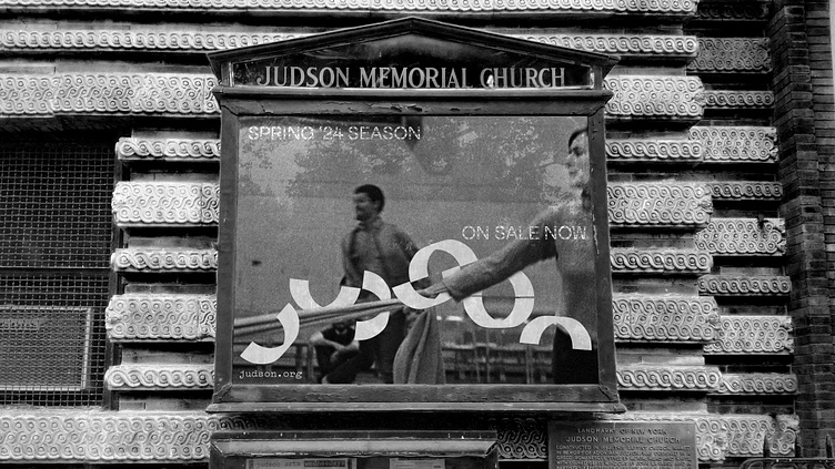
Judson Dance Theater Identity
The medium of dance, like all performance art, is ephemeral. Movement can only be observed and appreciated in a specific moment in time, and you have to be there to see it. But, despite this, many groups of dancers have found ways to record their work and let it continue to live beyond themselves. The Judson Dance Theater is one of these groups. Founded in the early 1960s in New York City, Judson is a collective known as the pioneers of postmodern and minimalist dance. Judson expanded the possibilities for what could even be considered dance in the first place, reframing everyday movement to become art. As one member of Judson put it, their work is “theory in movement.”
The identity system for Judson is built around the concept of composition and theory in movement. Using archival dance notations used by members to record their works, I created a typographic system for the logo consisting entirely of a simple arc shape. The repetition of geometric forms is a core technique of minimalist artists, and the solid version expands on the linear logo. Maintaining the historical legacy of the brand was also important, so typewriter lettering was included as an homage to their early flyers, and archival photography from Judson is the foundation for the system. Some images are treated in a “stuttering” technique, which mimics and exaggerates movement in a new way. On untreated images the custom type weaves around the images, as if it’s dancing with them.


