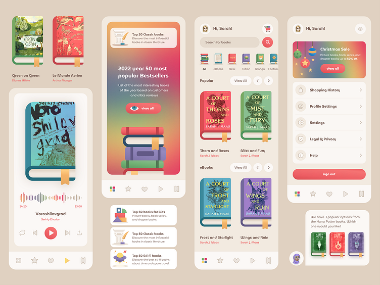
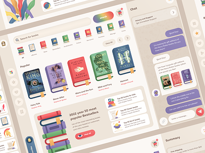
Book Store Mobile Concept 📚
Hi there 👋
While sorting through my files, I stumbled upon my old bookstore shot. The thrill led me to creation of the fresh version for mobile.
Right below, I'm showing a quick example of paddings and how I stick to the 8px grid. I want to illustrate that the real beauty in design usually comes from keeping things consistent.
More by Toma View profile
Like


