DO – Icons
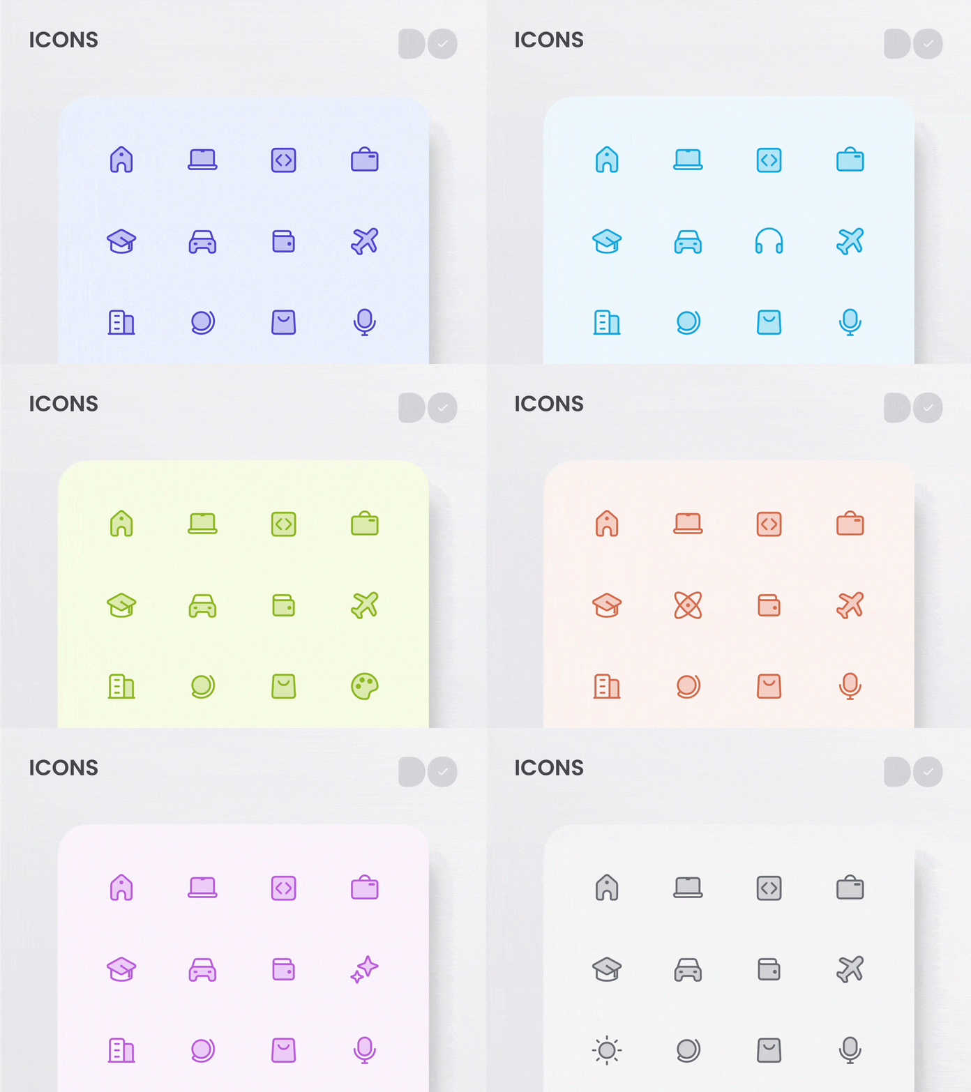
A set of Icons created for DO. Specifically designed to help users quickly Identify a project visually.
Update 🔔
I changed the style for the project icons. I also expanded the library!
Consistency
I could not maintain consistency with the current style. Duo-tone icons proved to be similar but easier to keep consistent.
Accessibility
I did not feel as if the current set of Icons were accessible. Accessibility should be at the forefront of the design process.
Happy Designing ☀️
More by Timothy Blubaugh View profile
Like


