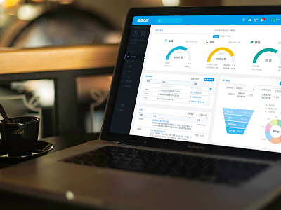
CRM Dashboard Interface WIP v2

I changed the sidebar to a very light shaded blue, in which to better suit for the taste of the main target audience. Seems for Chinese audience, who are strongly influenced by the doctrine of the Mean of Confucianism, they like light touch on everything and will reject designs with strong colors and high color saturation intentionally or unintentionally.
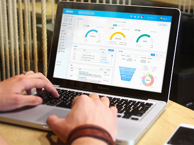
So what do you think? Which one is better?
Leave your comments below.