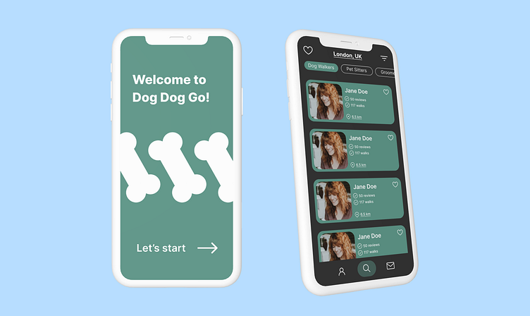
Dog walking app (UX/UI)
Hi everyone! Today I would like to share with you my recent project. I conducted an UX research and designed some screens for a dog walking app. This was my first time designing UX, and I'm quite proud of myself :))
Project Overview and Goals
Overview: The task was to create 3 onboarding screens + couple of home/search screens from scratch.
Goals:
Conduct a small research
Create User Persona
Create User Flow
Create wire frames
Design the UI of the app
UX Design
I conducted some interviews and came up with the User Persona. This was really helpful and inspiring!
This was the User Flow for the onboarding process. The final result of my work contains only 3 pages form this chart.
This is the example of wireframes, that I created for this project.
UI and Inspiration
I wanted to create a design that would appeal to the target demographic according to the UX research. Here are some designs that were on my mood board!
My idea was to create minimalistic but colourful design. These are the patterns that I created while brainstorming.
I decided to go with smoky green, white, and grey colours. Green associates with nature, as well as positive emotions. White and grey allow to keep the design minimalistic and cozy. The target demographic usually prefers darker UI, and designs that are not "screaming".


