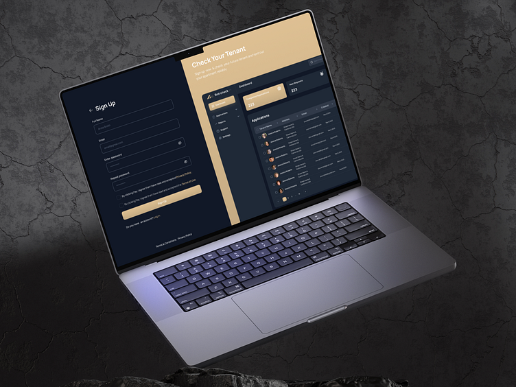
UI/UX for Real Estate, Platform for Screening Your Tenants
Hey Dribbblers! 👋 Excited to showcase my latest project, RnrtrCheck—a sophisticated Real Estate web platform that redefines tenant screening with a touch of premium style and a sleek dark mode. 🌌
Effortless User Journey:
RnrtrCheck offers a seamless 5-step tenant screening process, carefully crafted for both landlords and tenants. From initial contact to final approval, the user journey is designed to be intuitive and stress-free.
Premium Branding in Dark Aesthetics:
Elevating the brand with a premium touch, RnrtrCheck embraces dark aesthetics to create a visually stunning UI. The color palette and typography exude sophistication, providing users with an elegant and immersive experience.
UX Wireframes for Clarity:
Delved deep into UX wireframes to create an intuitive layout for the web app. The dark mode design not only enhances visual appeal but also prioritizes user comfort, reducing eye strain and offering a modern edge to the platform.
🚀 Coming Soon:
RnrtrCheckis gearing up for its debut—soon to be available, bringing a blend of sophistication and innovation to the world of real estate tenant screening.
🌟 Premium Style, Dark Elegance—Tap 'L' if you're ready for the future of tenant screening!
💌 Open to new projects! Reach out at asolldesign03@gmail.com
📱 Connect on Telegram: @ann_vinn


