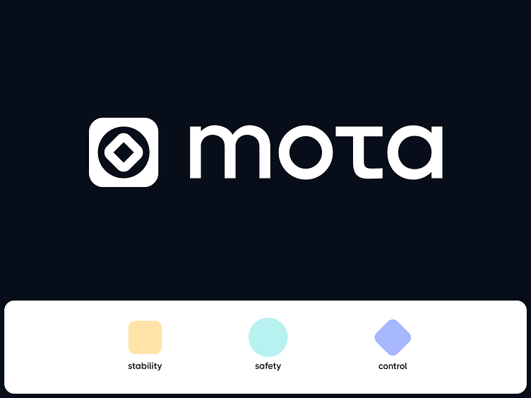
Mota - Logo and identity design for the remote work platform
Introducing our latest complex project Mota, a dynamic 3-in-1 platform and browser extension catering to file transfer, remote access, and video meetings. 🚀
🌐 Our Contributions to Mota's Visual Identity:
Logo and Brand Identity Design: Crafting a symbolic representation that seamlessly integrates stability, security, and control.
Promotional Landing Page Design: Captivating visuals and strategic layout to engage and enthrall visitors.
Landing Page Development on Webflow: Bringing our design to life with a user-friendly and visually stunning online presence.
UX/UI Design of the Platform Itself: Elevating user experience through intuitive design and seamless navigation.
UX/UI Design of the Browser Extension: Extending the brand seamlessly into the user's digital workspace.
🔍 Logo design
The logo of Mota is not just a mere visual representation, but a perfect combination of all that defines the brand.
It embodies the three essential aspects of the company, represented by three distinct shapes: a square which signifies stability, a circle which reflects security, and a rhombus that represents control.
These three shapes come together to form a visually compelling and aesthetically pleasing icon, which also encapsulates the core brand values of stability, security, and control.
🎨 Color Palette
Mota's color palette reflects its character. Red represents strength, while blue and purple signify safety. Yellow radiates joy, and green embodies peace.
Each hue is carefully selected to convey a specific brand attribute, contributing to a vibrant and meaningful visual experience.
✒️Typeface
Meet THICCCBOI — the chosen typeface with its geometric and rounded letters perfectly complementing the brand's character.
It not only adds a touch of modernity but also ensures a cohesive aesthetic that resonates with Mota's identity.
🎨 Style Consistency
The square shape, a symbol of stability in the logo, is echoed throughout Mota's brand collateral via block rectangles and text selections, maintaining a consistent and visually pleasing design language.
Don’t let your brand image get lost in the noise.
With design and branding, Outcrowd helps to reveal the essence of your brand and transform it into a powerful force that excels in results.
Email us: hello@outcrowd.io
Become a part of Outcrowd communities:


