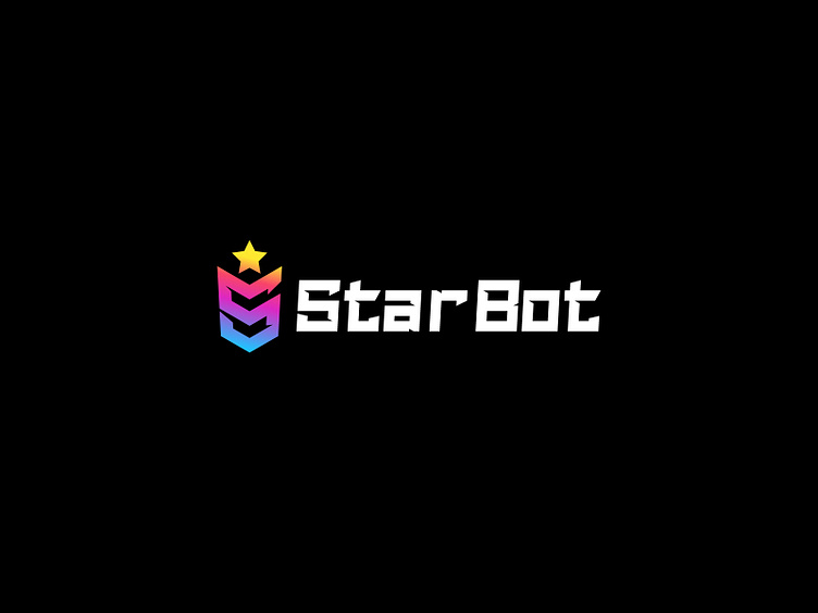
StarBot Brand Logotype
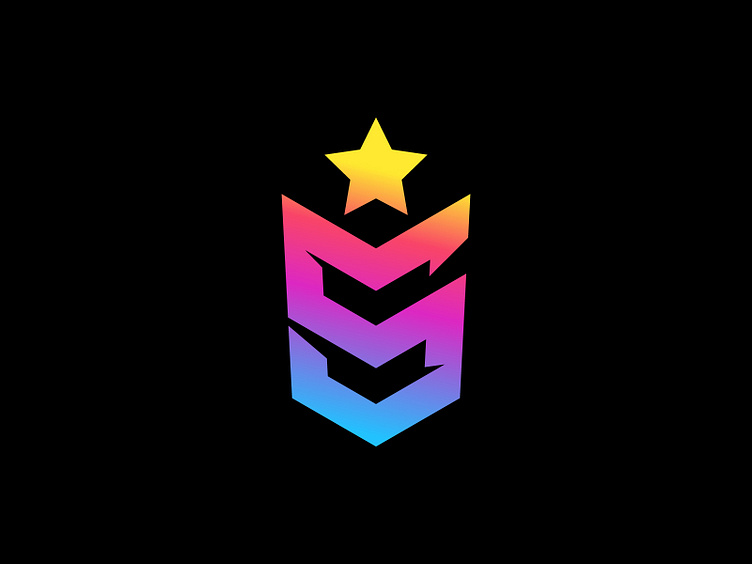
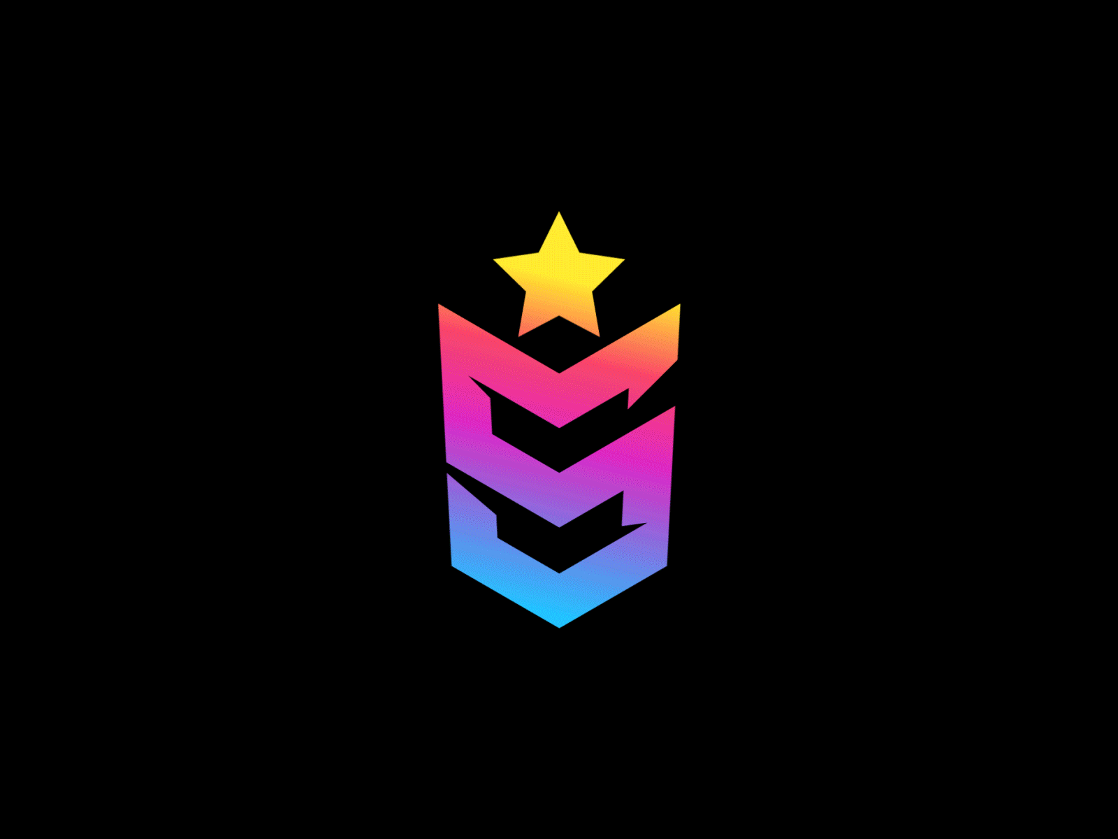
The task of developing a logo for the platform was to create a visually clear sign that would immediately tell about the difference from competitors precisely through its system of awards and ranks.
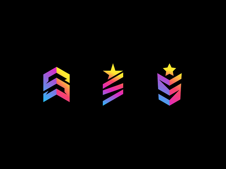
So I was looking for a shape that would give the sign a chevron look.
Although trading and arbitrage is a serious activity, ranking achievement is gamified, thereby creating constant engagement.
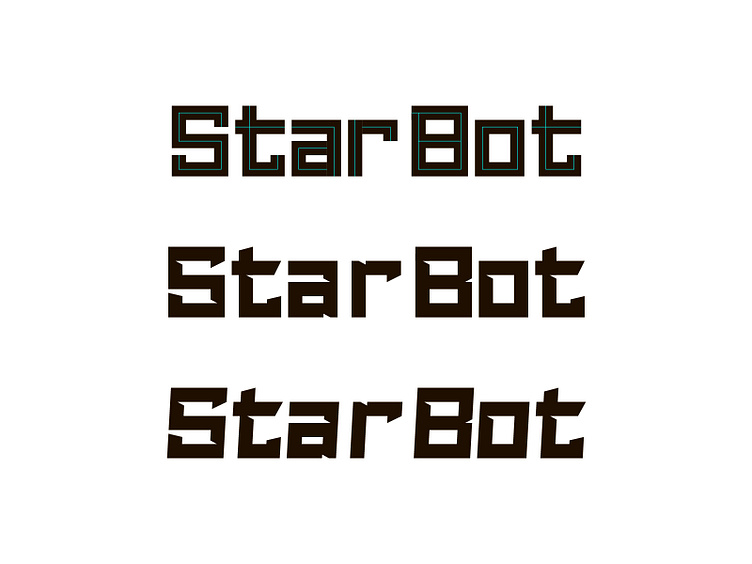
After confirming the sign part of the logo, a unique typeface of the brand name was developed
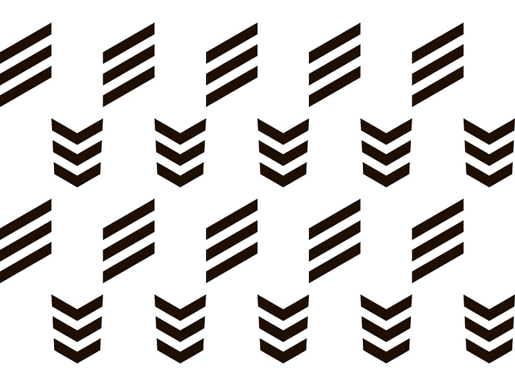
As an addition to the process, this is what the search for the shape of the sign part looked like.
If you want me to develop a rather interesting brand identity for you, please contact me dzhevaga.design@gmail.com
