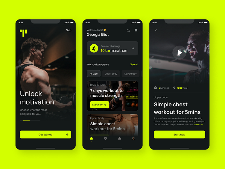
Todo Fitness App Design
I've recently worked on a Todo Fitness App, a cutting-edge application designed to revolutionize body transformation through a combination of impactful exercises, personalized fitness plans, and advanced statistical tracking.
In crafting the app's visual elements, I strategically employed a dark colour scheme to ensure optimal contrast within the interface. This deliberate choice extends to the text, icons, and images, creating a visually engaging and user-friendly experience. To enhance the call-to-action (CTA) and underscore a sense of security, I integrated a vibrant Neon Green colour. This choice not only provides a striking contrast but also symbolizes the assurance that users can attain health benefits and strengthen their bodies through the app's comprehensive features.
