Alliance Digitale - Brand Design
Digitalliance (now named Alliance Digitale) is one of the projects I worked during my time at Locala. What I love about this project is that I had the opportunity to bring more life to the Advertising ecosystem which I always found a bit sad, or too serious.
About the Start-up
Digitalliance's ambition is to structure the digital marketing industry by offering innovative, responsible and interoperable solutions. They strive to define the standards and best practices of the sector to ensure a reliable and efficient environment necessary for the development of digital marketing.
They play a key role as a privileged interlocutor of public authorities, media and other professional organizations, involved in digital regulation and the promotion of an open Internet.
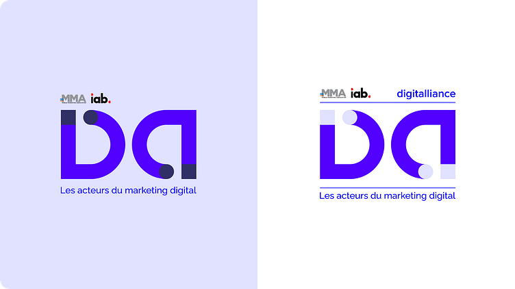
Logo Design
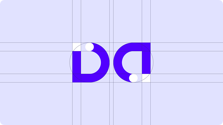
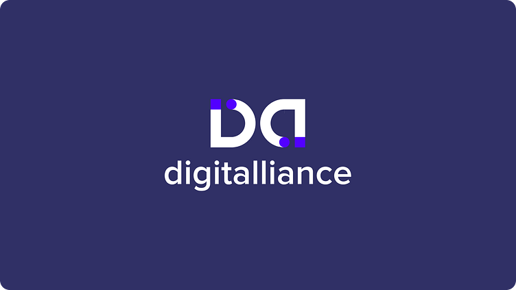
I wanted the logo to be simple, modern, but also with a strong capacity in branding in the long run. I chose to play with the "D" of digital and the "A" of Alliance making a symbol that is in a frame but that also gives this vibe of roundness, of the lifecycle.
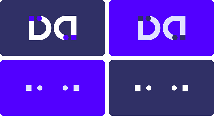
For the symbol, I wanted to have multiple solutions in terms of logo usage, you can see that the logo works with the Icon, with the shapes only, but it needed also to work with the brands that power this association.
The squares and circles give this very minimalistic touch, without going against the feeling of seriousness first, creativity and flexibility, and seriousness at the end again, it can be read left to right, or right to left reinforcing even more the idea of the life cycle.
As Digitalliance is an association, multiples acotrs of the AdTech ecosystem will be powering and engaging with them to work on high level actions.
The logo needed to be simple enough to work with thoses logo in what we call a "brand block" or "logo block".
Here are a few examples :
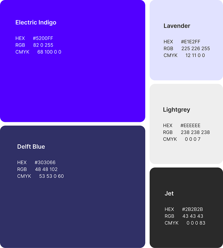
Color Palette
Colors are used to reflect the brand's mood and mission. Their true power lies in building connections and associations.
Again, to make the AdTech a bit more cheerfull and a bit more human, I chose colors that are vibrant, but also soft and simple.
Each color of the brand has its own meaning:
Electric Indigo means dynamism, creativity
Delft Blue - calm, simplicity
Lavender/Lightgrey - softness
Jet - seriousness
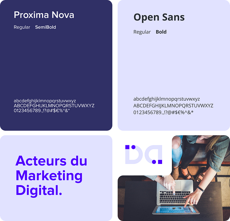
Font
The fonts are chosen to make the brand unique, but also readable.
Let's be honest, in terms of font, I had to stay very classic. I chose two fonts that works well together, but alos apart. Both are strongly readable, and don't make waves.
Proxima Nova will often be used in print design, it is also the main font for the logo.
Open Sans is the font for web, digital design. It is very simple, readable and will be accessible with enough contrast.
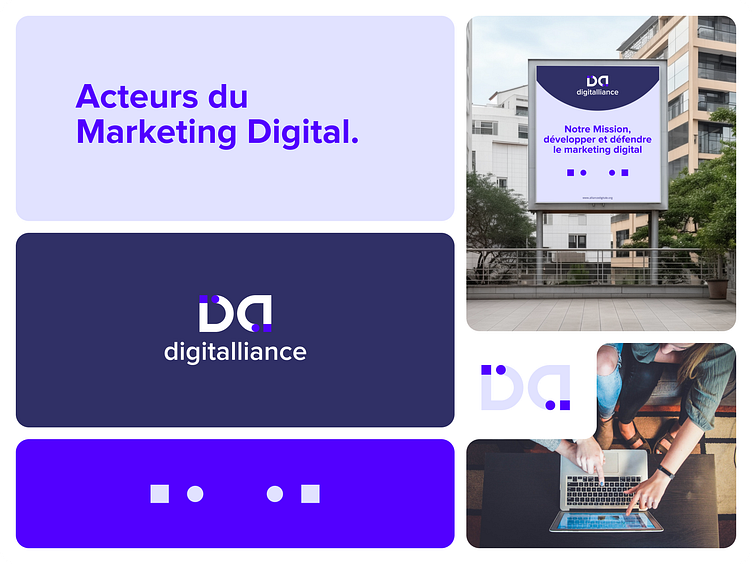
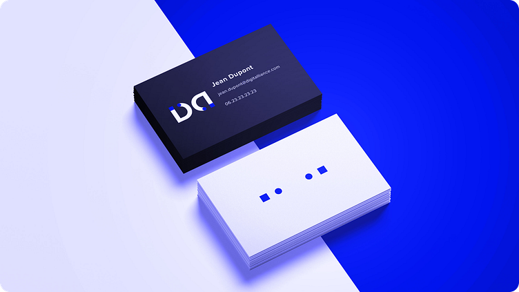
Mockups
Mockups are a great way to have a visual representation of the brand, and also test its real world application.
if you are looking for a designer feel free to contact me on Dribbble or ask.soledris@gmail.com.
Thanks,
Quentin