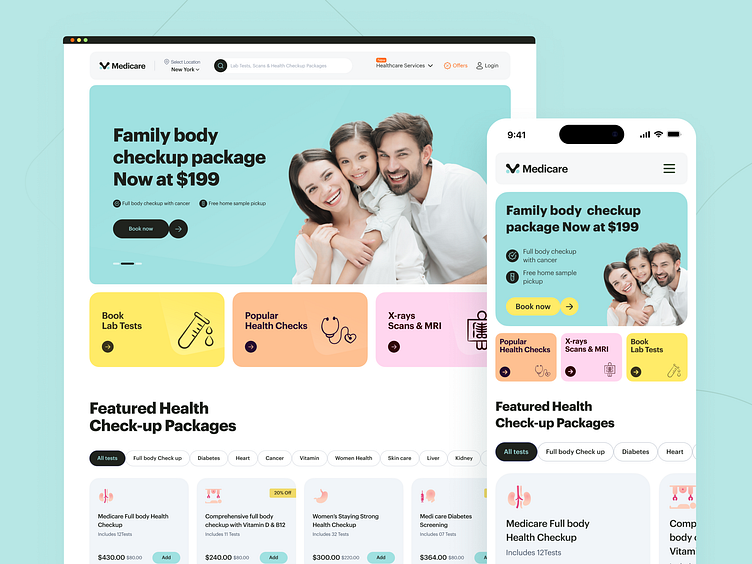
Medical Check Mobile Experience | Lab Test Booking Website
Many healthcare websites don't make it easy to find affordable health checkup deals. This annoys users and leads them to abandon the site without getting the care they need. Because of this type of user FRUSTRATION, we have seen many websites stop providing service or go out of business.
So, we experimented with it and made a proven solution to this!
How did we do that?
We add robust budget-wise filters in our newly designed Medicare site model. Then we ornamented that with engaging UI elements. And we've designed different package features to meet the needs of different age groups.
Want to turn your Medicare website from a frustration into a profitable asset?
Schedule a 30-minute free consultation call with one of our experts and let us identify any flaws in your website.
☎️ 👉🏼 Calendly.com
We appreciate your interest, Dribbblers! 😍
Schedule a call at ☎️ 👉🏼 Calendly.com
Let's talk about your project..
✉️ hello@musemind.agency
Website 🌐 musemind.agency
Explore Our Design Case Study Featuring ➡️ Behance
Let's Check Our Others Dribbble Profile
musemind saas • musemind mobile • musemind branding
Follow us to see more exciting shots and insights on
Linkedin I Instagram I Twitter I Medium I Facebook I Webflow I WhatsApp

