Website for the SMM course
Hello, world 🌏👋
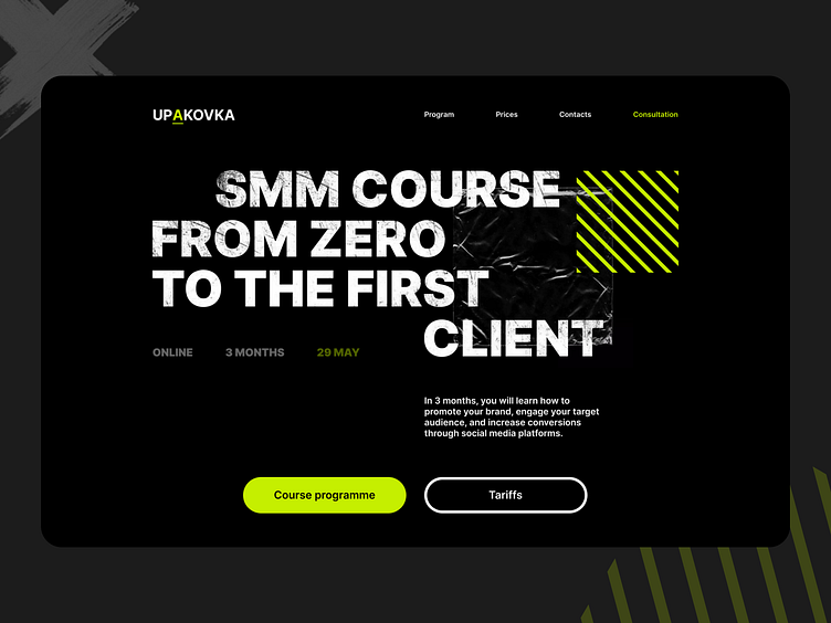
Today I want to show you one of my works, namely a website for a course on SMM.
The target audience of the course is young and ambitious people, so I developed a modern and youthful design, adding an accent light green color and graffiti elements.
There are also elements of files for papers, different types of tape, and cellophane packages, do you know why? The course is called UPAKOVKA (Packaging), which means that the course positions itself as one that will pack any course, any case, any specialist in the industry, and that's what I additionally conveyed through these elements.
The site is as structured and clear as possible, which makes it possible to draw the user's attention to the most important things.
You can see the full case study on my Behance
Do you want to get the same cool solution for yourself?
Write to me in Dribbble or to one of the contacts below 👇
