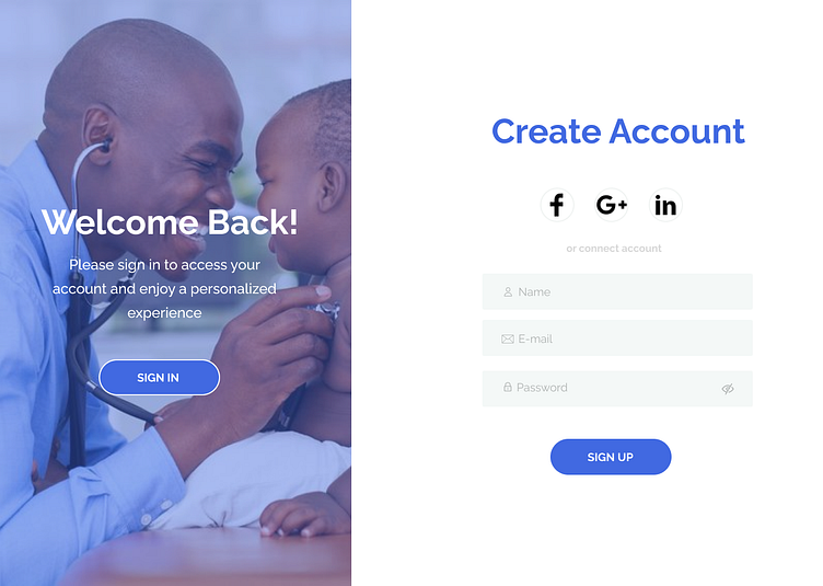
MediCare - A paediatric medical webapp form sign up experience
Forms are important in user interfaces because they give feedback on whether the information you entered is correct. In the following discussion, I'll talk about how we can let users know if there are any mistakes in what they've entered.
The state mentioned indicates that when someone puts in something incorrect in the form, the red color is used to show an error or danger. This signals to the user that there's a problem. Additionally, the text below the input field explains to the user what the issue is.
In this error free state, the user isn't prompted, giving them the idea that they are still on the right track, allowing them continue their journey.
Password error state
The state described represents when a valid input is entered into the form. The use of green, typically associated with correctness or success, communicates to the user that they are on the right track and their actions are valid. Additionally, the text below the input field explains to the user exactly what they did right.


