Veritas Marriage Conference - Visual Identity & Promo
This fall, Veritas Church decided to offer their first-ever in-house marriage conference!
The creative brief? No cheesy, stereotypical wedding imagery. Appeal to both women AND men - something husbands would want to sign up for, not just tag along because their wives made them...
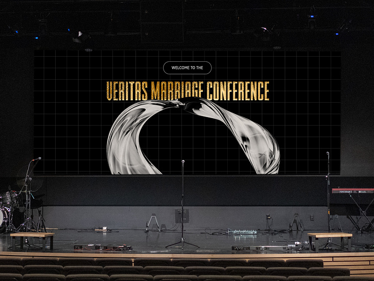
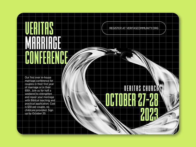
Enter electric green, black&white, a sturdy grid background, and an abstract loop. 👀
Electric green because it's energetic, fun, and attention-grabbing. Black and white balance that out with a vibe that is edgy, yet also safe and mature.
A gridded background adds texture and structure in a way that creates tension with the loose abstract forms of the glassy loop.
And finally, the loop adds some wow factor (and a memorable icon to carry across collateral) and symbolizes a wedding ring, which of course symbolizes eternal love and commitment. 💍
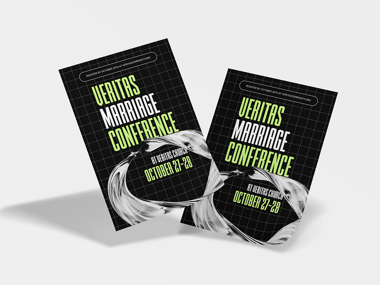
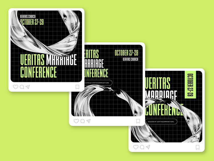
Promotional materials included a printed 4x6 save-the-date, several social posts, and stage graphics used during Sunday service announcements.
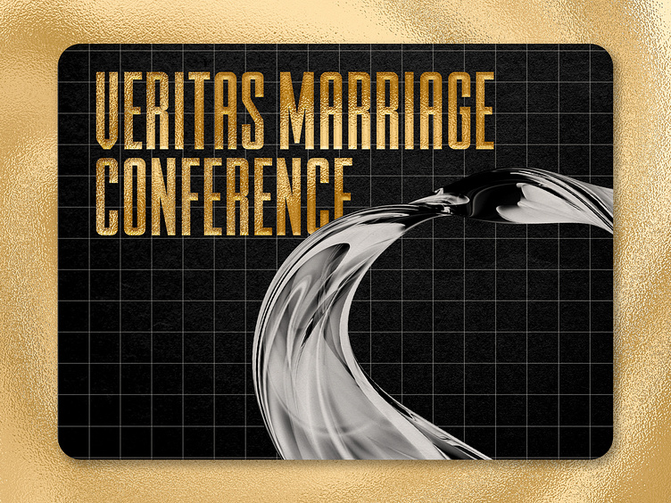
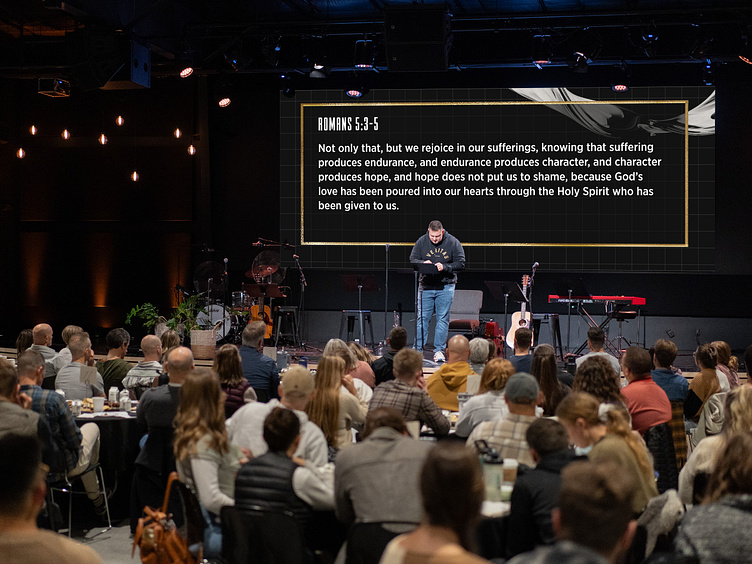
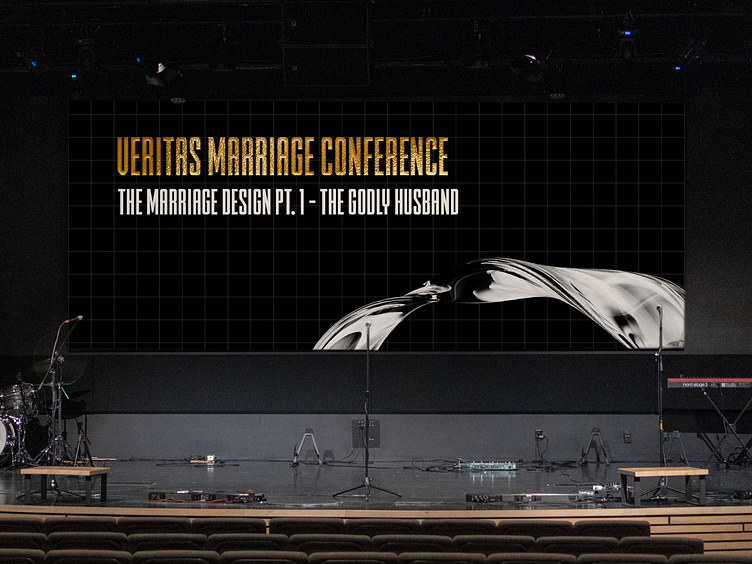
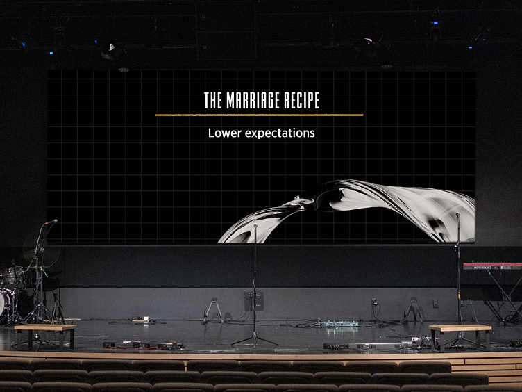
For the conference itself, we wanted to add some warmth to set the tone for a "date night" feel throughout the auditorium. Cue the Edison bulbs, round tables, and fancy snacks galore! For the graphics, I opted to swap the electric green for some gold foil to bring some warmth & class to the screen, complete with a matching slide deck for the speaker notes!