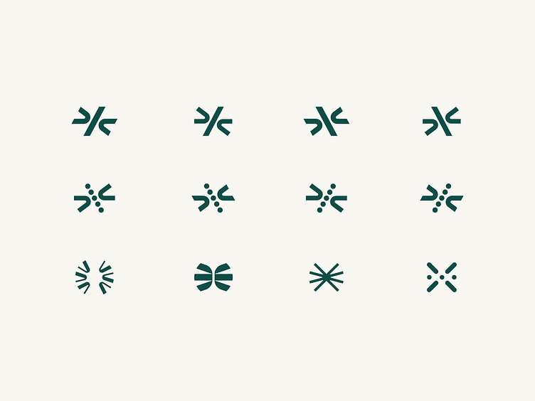
Comulate Logo Exploration
We love a good logo exploration. Final product below. 👇
Automation. Agility. Focus. These inspirations are found within Comulate’s mark, which took cues from a spoke-like design and transformed into something iconic, with bolder, weightier strokes — and the essence of forces coming together to make something wholly new.
Complementing that synergistic force is a custom logotype, built using Oatmeal Pro and balancing a simple, clean aesthetic with a sophisticated, upbeat personality. Of note, Odi’s design team made unique modifications to both the “a” and “t” in “Comulate,” to create an ownable, all-lowercase logotype with even more distinction.
Head to the full case study: https://odibrand.agency/work/comulate
---
Looking for a brand agency? We would love to hear from you.
Email us: hello@odibrand.agency
Our Website / Instagram / LinkedIn / Twitter

