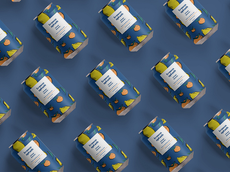
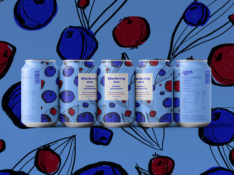
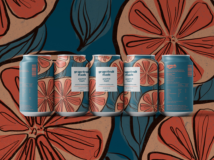
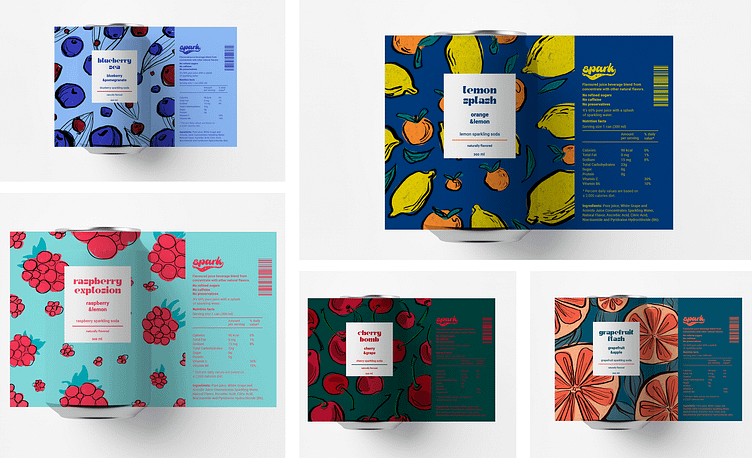
Soda drink|packaging design
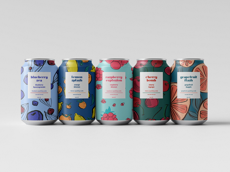
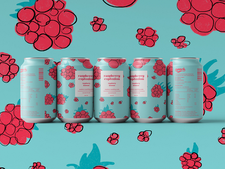
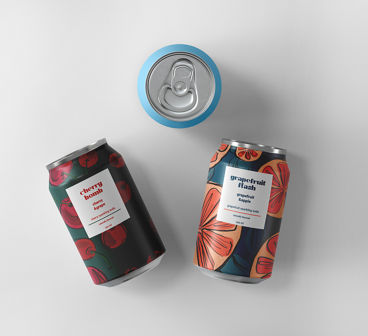
Spark is a young beverage company.When I was creating the packaging, it was necessary to emphasize the bright taste of soda with the colorful packaging, contrasting and saturated colors.Stylized fruits, as if casually drawn by a child's hand, are a hint of the playfulness of taste, its richness and spontaneity.The logo was designed based on a font with a slight stylization of soda bubbles.The whole project is based on vivid images of fruits, which reflects the company's concept of fun, kindness and freedom.