Empty States
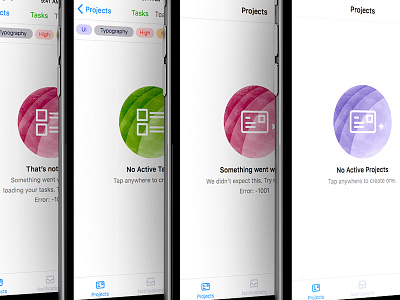
Taking the 5-States of UI approach for Zypher 2.0 and worked out these error and empty states for the two most important screens the users will interact with daily.
While keeping the iconography between the two states static and shifting color instead, allowed me to be a bit more creative with the styling.
Also, love San Fransisco. It renders so damn well. <3 I have 4 more to go, but I thought I'd do a quick show and tell so I can get some feedback in the mean time. Cheers!
More by Dezine Zync Studios View profile
Like

