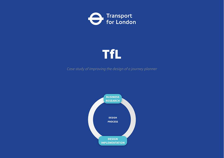
Design Improvements | TfL
Business Research
The Transport for London (TfL) website is a crucial tool for millions of commuters and travelers navigating the city's extensive transportation network. The mobile website plays a pivotal role in providing journey planning and real-time information. To enhance user experience and streamline the journey planner and results section, I propose a redesign of the website.
Problem Statement:
The current design of the TfL mobile website may not fully align with evolving user preferences, leading to occasional usability issues, user frustration, and potential loss of business. These challenges can hinder the overall user experience and discourage users from relying on the TfL website as their primary source of travel information. It is imperative to address these concerns by focusing on the journey planner and results section.
Proposed Design
The redesign mockup for the mobile TfL website focuses on optimising the user experience within the Journey Planner by streamlining the journey planning process. Key enhancements include:
a dynamic button for swapping from and to locations
switchable tabs for different journey types
a fixed navigation bar providing easy access to important pages.
Key Features:
Swap Locations Button:
The prominently placed button between the location fields allows users to effortlessly swap them, providing flexibility and convenience in journey planning.
This feature simplifies the input process, especially in scenarios where users may have entered locations in the wrong order.
Switchable Tabs for Journey Type:
Intuitive tabs for journey types (single, return, open return) are incorporated, allowing users to easily switch between different travel plans.
Fixed Navbar for Easy Navigation:
The navbar includes quick links to essential sections (Search, My Tickets, Live Travel, and My Account) enhancing user convenience and navigation efficiency.
