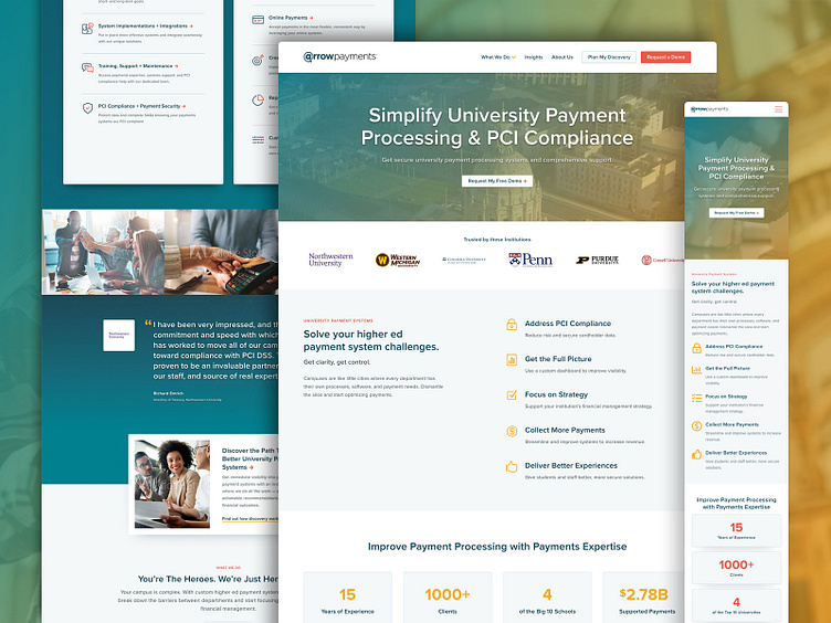
Arrow Payments - Website Redesign
Overview
Arrow Payments is an industry leader in providing payment processing services to universities. They’ve set themselves apart by providing an all-in-one experience with their wide range of services and commitment to building personal and lasting relationships with clients. They were looking for a redesign that emphasized their large scope of services through storytelling and visuals.
We designed a site that did just that. The redesign included a simple yet robust navigation with a mega menu (featured below) that spotlights a wide range of capabilities. We also optimized the conversion path by creating clear messaging that put the benefits of their services at the forefront.
Through our partnerships, we built a sleek and authoritative website that welcomed clients into the next steps of improving their university payment processing.
Iconography
We tailored the icon set to Arrow Payment's distinctive color palette, and we developed two different styles to differentiate the different use cases... the two-color set was used for the mega menu, while the yellow-orange one-color icons were intended to be used within the page blocks of content.
View the Live Site
Check out Arrow Payments website!


