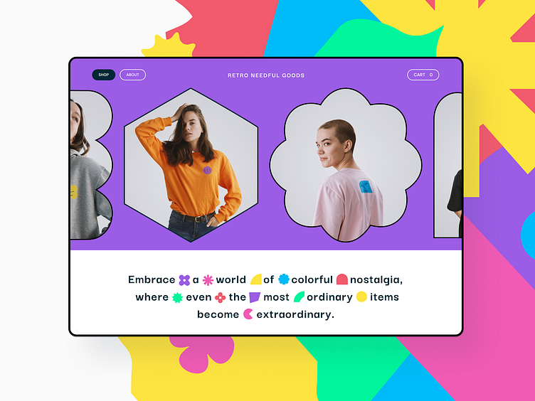
POD Store: UX/UI Webshop Case Study
Hello Everyone 👋
Introducing "Retro Needful Goods" – a culmination of meticulous UX research and analysis. Through competitive benchmarking, design workshops, personas, and customer journey map, this webshop has emerged as the epitome of thoughtful design.
After delving into the intricacies, it became clear – simplicity is key. I've streamlined the user experience, ensuring an effortless journey from browsing to checkout. The design reflects this ease with a clean, readable, and witty font, amplifying the fun. Happy colors adorn every pixel, making your shopping experience as vibrant as the products themselves.
For a deep dive into the journey behind "Retro Needful Goods," explore the full case study on my Behance. Behance link
In a world of choices, we've made yours simple and joyful. Welcome to a webshop that's more than a storefront – it's an experience.
Press (L) if you like it, and don't forget to follow @arminmujkic dribbble account to get tons of inspiration for web and mobile design, and amazing case studies.
=================
Wanna collaborate with me?
Learn more about me: armin.mujkic
Connect with me: armin.mujkic91@yahoo.com
Thank You for scrolling! 😉

