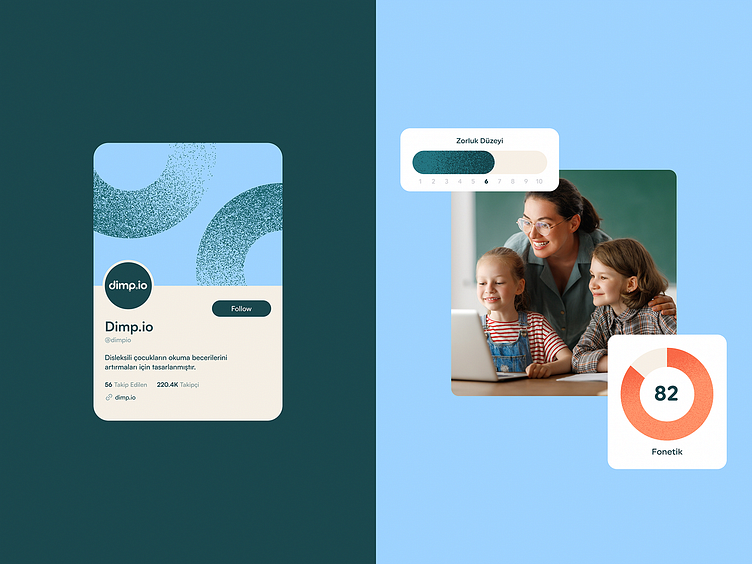
Dimp.io landing page design | UX & UI
Presenting exciting details of our newest landing page project: Dimp.io!
Dimp.io is a learning platform to help children with dyslexia improve their reading skills and vocabulary through videos, interactive and adaptive exercises, and educational content.
The color palette and interface were designed to create a welcoming and engaging landing page, communicating Dimp.io's values and services efficiently. The overall aesthetic of the landing page is modern and professional, with its light background and clean typography contrasting with playful icons and visual information.
Hi all! 👋🏼
We are Prelab, a duo of designers who came together to create meaningful experiences. We believe designs that make a difference are the ones telling a story. Starting from the UX to the UI, we help start-ups and established businesses transform their ideas and purposes into unique digital experiences that tell their stories.
Our area of expertise covers UX/UI Design, Web Design, Responsive Design, UX Audit, Market Research, SaaS, Brand Strategy, Visual Identity, and Design Systems.
INTEREST IN WORKING WITH US?
We are available for new projects!
Email us at hello@prelabstudio.com
DO YOU LIKE OUR NEW CONCEPT?
Share with us your thoughts!
WANT TO SEE MORE IN THE FUTURE?
Don't miss any of our shots by following us in Dribbble.
Press ‘L’ if you love it! 💜


