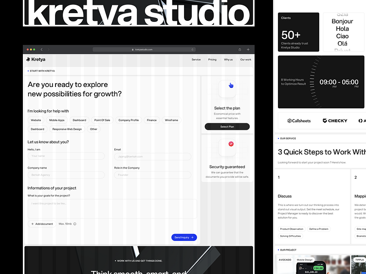
Kretya Website Redesign - Behind The Sceen
Hello, Dribbblers
Today, we're thrilled to share an exclusive glimpse into our design journey!
Buckle up for an exciting news as Kretya Studio's website undergoes a fresh transformation, combining innovation and imagination.
Explore the exciting steps and creative process behind the scenes as we transform inspiration into reality. Join us as we unravel the journey of this design.
See the magic live → https://kretyastudio.com
MoodBoard
Next up, MoodBoards. We collect every parts and inch of any websites that taken the concept of Semi-Brutalism and take it further with our studio style and art.
The Concept
We have run through many kind of concepts over and over to get the perfect balance of how we want to show the new look to many people. With minimalist and clean concept.
Before and After
Past is past, we have came a year ago with our initial design for the first Live Website. Today we have changed, but we still taking over the colors to our new website and fully remake it to a new fresh modern concept.
Welcome to the New Kretya Studio
We present the new face of Kretya Studio is a testament to our collective growth, honed skills, and unwavering commitment to design innovation.
Partner with Kretya Studio Now!
Intrigued to collaborate? Share your thoughts in the comments and reach out at
hello@kretyastudio.com | kretyastudio.com
Stay connected to our journey by keeping up with us on
LinkedIn | Instagram | Behance | Clutch for the latest updates.


