Card Design UI UX
Hello, Dribbble 🔥
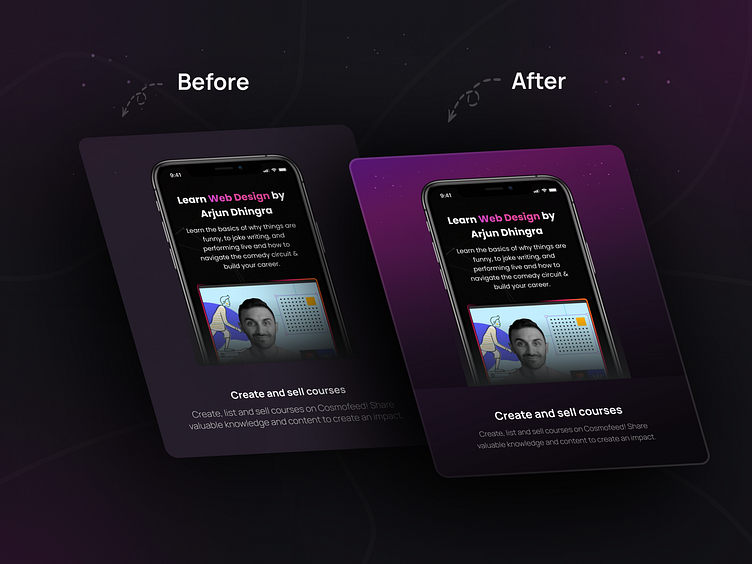
I recently improved the card design of the website www.cosmofeed.com
I wanted to make it more eye-catching and appealing to potential buyers.
Here are some of the changes I made:
Changed the background color: I switched from a dark background to a purple gradient background. This creates more contrast and makes the text and illustration stand out more.
Adjusted the text alignment and spacing: I aligned the text and increased the spacing between the lines. This makes the text easier to read and follow.
What do you think? Do you have any feedback or suggestions for me?
Interested in our work? Just drop an email 😍
📪 hello@smartuxdesign.com
. . . . . . . . . . . . . . . . . . . . . . .
Follow me 🏀 Dribbble
WhatsApp 📞 (+91)8347412540
Telegram 📱 @Nisharmultani
Connect 🔗 Linkedin
MoreWork 😎 Behance
Follow Me 🔥 Instagram
Have a project idea? We are available for new projects.
→ Reach out to us using any of the links below to learn more.
📮Send Email
📅Schedule a meeting
----✦----
Follow us to see more works!
Dribbble | Linkedin | Behance | Instagram | Telegram | WhatsApp

