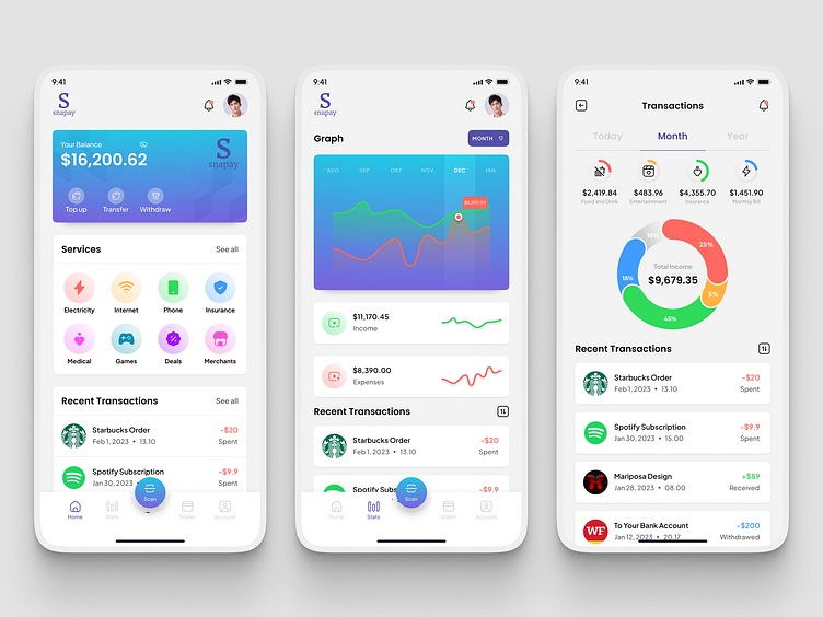
Digital Wallet App Design
Pain Point
The primary pain point is the complexity of financial transactions and the lack of clarity in the application's interface, resulting in user dissatisfaction and potential security concerns.
Users are currently navigating through a cluttered and unintuitive interface, leading to frustration and a high bounce rate. Improving navigation and simplifying transactions are top priorities based on preliminary user feedback.
Snapay
The Digital Wallet App UI Kit is a comprehensive set of user interface elements tailored for a digital wallet application. It includes seamless navigation, secure transaction flows, and an intuitive interface to provide users with a convenient and efficient financial management experience.
Thank you for scrolling 🙏
💖 Show your support by pressing (L)
👉 I'm on socials, follow me on Figma Community | LinkedIn | X/Twitter | UI8
Check out my portfolio website and let's collaborate


