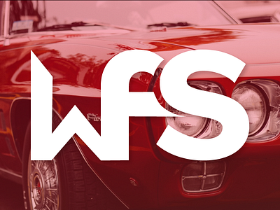
Day 12: The Car Company
This is Day Twelve of Thirty Days of Logos, in which I share a new logo idea for my design studio, Wildfire Studios, every day for 30 days.
A little late today; it's my day off and I forgot to share this earlier before getting busy around the house. I spent a lot of time on this one, working on the details connecting the W and the F in particular. I'm also a huge fan of the way that the F and the S are connected.
In this case, I made the W by hand because I couldn't find a W in my collection to act as a good starting place for this logo. The F is a heavily modified version of Proxima Nova, and the S is Proxima Nova bold.
It reminds me of a logo for a car company, for whatever reason. I love the way this logo looks, but I don't think it's immediately clear or legible. I don't think it presents a clear vision for what my studio does either. This logo is problematic because it is clearly design for design's sake, which a lot of us are notorious for, but I think need to avoid it at all times.
That said, what this logo needs more than anything is a little bit of TLC. It's a natural evolution of Day 11's logo, and adjusts some of that logo's issues, but also has a few of its own.
Would love to hear your thoughts on this direction.

