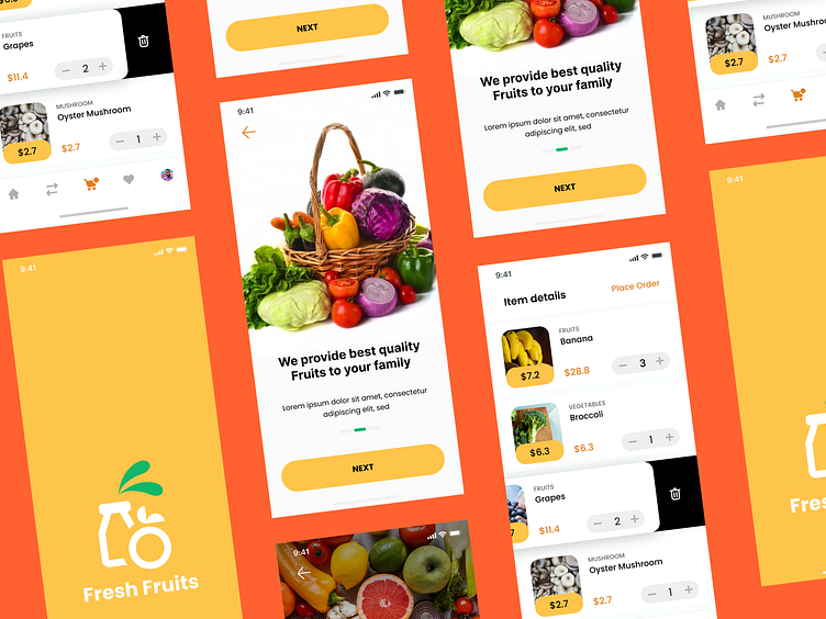
Grocery Mobile App UI Design
Title: "Streamlining Shopping: A Grocery App Case Study"
Introduction: In today's fast-paced world, convenience is key, and grocery shopping is no exception. It has intuitive design, seamless navigation, and user-centric features.
Objective:
The primary objective of the Grocery Mobile App UI Design is to simplify the grocery shopping journey for users, making it efficient, enjoyable, and hassle-free by leveraging user-friendly interface design, smart features, and personalized recommendations.
Design Concept:
The design concept revolves around creating a user-centric interface that prioritizes functionality, aesthetics, and ease of use. Emphasis is placed on visual hierarchy, intuitive navigation patterns, and consistent branding elements to ensure a cohesive and engaging user experience across all touchpoints.
Key Features:
Personalized Home Screen
Intuitive Navigation
Smart Shopping Lists
Seamless Checkout Experience
Community Engagement
Outcome:
The Grocery Mobile App UI Design has successfully redefined the grocery shopping experience, garnering praise for its user-centric design, intuitive features, and seamless functionality. As a result, it has emerged as a trusted companion for users seeking a modern and hassle-free approach to grocery shopping.
