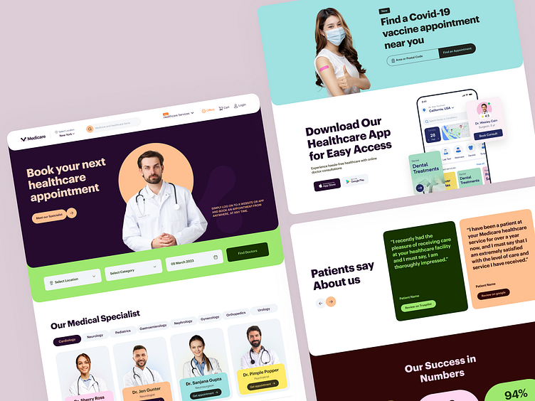
Online Doctors Booking Website
Your healthcare website may be confusing your visitors. There are hundreds of consultants to choose from!
If your website doesn't suggest which doctor to choose, they may switch to another one...
That's how you LOSE your visitors!
We have a solution for you. Our newly designed concept Medicare website is a proven system for doctor appointments.
How it's different? Our well-optimized filters help your visitors choose the right appointment within seconds.
Our visual elements are so intuitive that a five-year-old can make bookings.
After watching the animation, let us know your thoughts.
Don't want to lose your visitors and help make your competitors win?
Mockup Preview 💻
Schedule a 30-minute free UX consultation call with one of our business experts. No sales pitch, only value:
☎️ 👉🏼 Calendly.com
Full Preview🚀
We appreciate your interest, Dribbblers! 😍
Schedule a call at ☎️ 👉🏼 Calendly.com
Let's talk about your project..
✉️ hello@musemind.agency
Website 🌐 musemind.agency
Explore Our Design Case Study Featuring ➡️ Behance
Let's Check Our Others Dribbble Profile
musemind saas • musemind mobile • musemind branding
Follow us to see more exciting shots and insights on
Linkedin I Instagram I Twitter I Medium I Facebook I Webflow I WhatsApp


