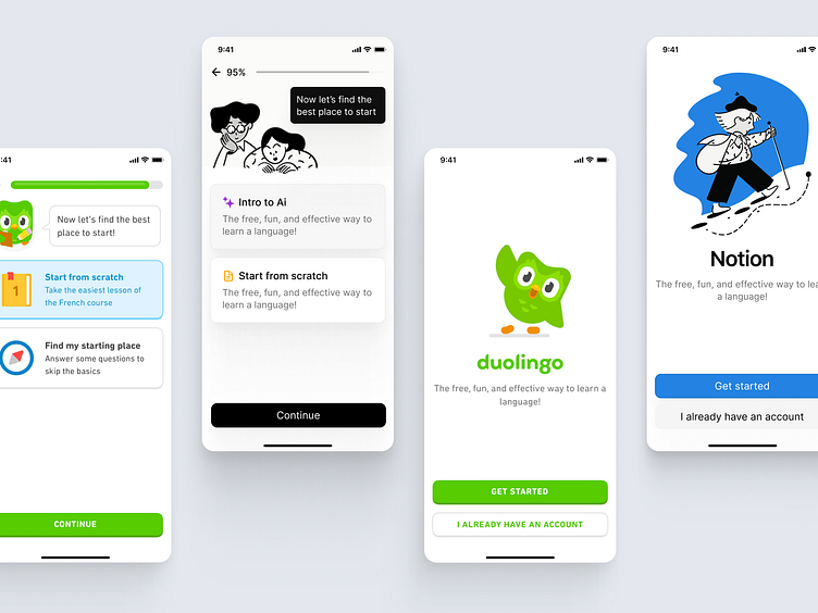
When Notion Meets Duolingo's Vibrancy
Notion's minimalist interface with the playful and vibrant essence of Duolingo.
→ Colors 🌈
The use of color is a language that communicates brand values and user interaction cues.
→ Illustrations
They breathe life into the user experience, making it relatable and engaging.
→ Outcomes 🖼️
I discovered that while Notion's clean, monochromatic layout promotes focus and organization, Duolingo's bold and colorful illustrations inspire fun and motivation.
More by Pablo Alejandro Gomez View profile
Like


