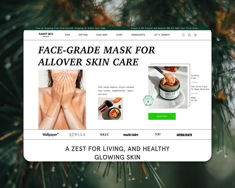
Web Banner for Skincare brand
Modern brands demand modern solutions. We created this banner concept to underscore the importance of breaking away from traditional templates and to encourage brands not to be afraid to experiment and express themselves.
The first impression is crucial! To make your "Hero" section highly conversion-oriented, pay attention to the following aspects:
Clarity of your value proposition (it should be clear what is offered on the website).
Size and contrast of the button (it should instantly attract attention).
Image presentation (show the product you are promoting).
Ensure that the size of the navigation menu does not take up too much space on the screen.
Provide the shopping cart and search in a familiar format for the user to reduce cognitive load and ensure a smooth user experience.
Don't be afraid to experiment! Sometimes, stepping beyond the boundaries of a standard banner template can help your brand showcase its uniqueness and stand out.


