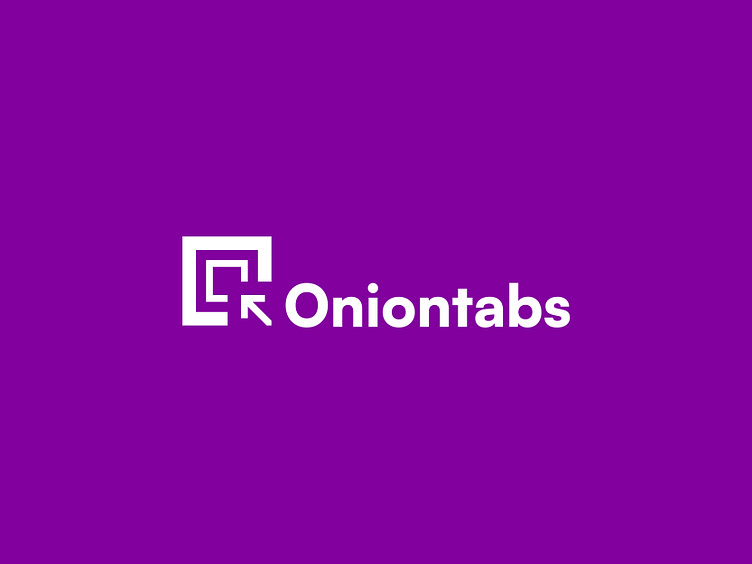
Oniontabs Logo Rebrand
We have updated our brand identity to reflect our state now and where we look forward to going in the future.
Though subtle, we tweaked our logo to give it more balance using the grid system. We also changed the brand's typography to Satoshi, a modern geometric San serif typeface that is timeless.
The brand colours were also updated, making our primary purple pop while other complementary secondary colors were also introduced to support the overall visual identity. We are now excited about our new look and what's coming.
What do you think of the new look?
More by Oniontabs LLC View profile
Like
