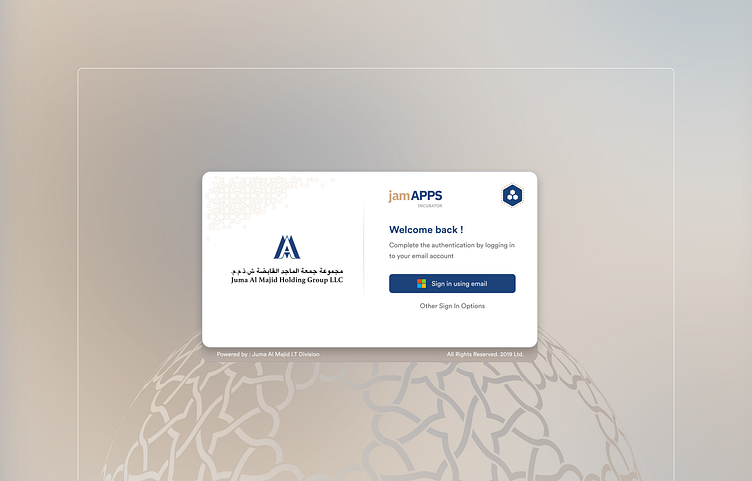
Redesigning for accessibility (WCAG AA)
Our objective was to enhance the accessibility and responsiveness of the app incubator, which is utilized by over 5000+ employees.
The previous version of the incubator had the following appearance.
The redesign was successfully accomplished within a two-week design sprint. We encountered various challenges stemming from the platform on which the incubator was constructed—Oracle APEX, a low-code platform
Among many of the components we redesigned, the notifications panel had the most impact. Previously, most employees didn't notice that they had a notifications panel at all !
This lead to approvals being delayed, requests not actioned upon and whole lot of other issues.
Unlike the previous notifications, which did not redirect you to the corresponding application upon clicking, we have implemented this functionality for the new notifications.
and now, the responsiveness.
Interesting ? I'm still creating a case study for this on my portfolio site which will be up soon.
Thats about it folks. Thanks a lot for the read !


