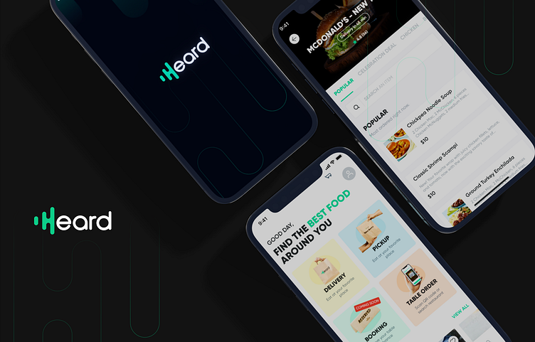
Heard App
Are you hungry? Did you have a long and stressful day? Interested in elevating your dining experience with a seamless and delightful interface? Whether you're craving a cheesy pizza delivered to your office or aiming to skip the weekly grocery run, Heard is your go-to destination! In this UI/UX case study project tailored for the USA market, we delve into the design intricacies that make Heard the perfect solution for your culinary needs. Explore an extensive list of the finest restaurants and enjoy streamlined table ordering, all meticulously crafted to enhance your everyday dining convenience.
Wireframe
Creating wireframes for the Heard app posed several challenges, with a primary focus on refining the delivery, table ordering and search flow to ensure a seamless user experience. Drawing inspiration from successful apps like Food Panda, Toast, and Zomato, our goal was to integrate the best features while addressing unique challenges.
Design
The design of the Heard app within the Material Design system is a testament to a thoughtful and user-centric approach, meticulously crafted to enhance the user experience in the realms of delivery, table ordering, and search functionality. The wireframe serves as a foundational blueprint, strategically addressing challenges encountered during the design process.
Taking cues from industry leaders such as Food Panda, Toast, and Zomato, the design incorporates the best practices and successful features that have proven effective in similar applications. The primary focus revolves around refining the delivery process, optimizing table ordering mechanisms, and streamlining the search flow, all aimed at providing users with a seamless and intuitive journey through the app.
The Material Design system is leveraged to bring consistency, clarity, and a modern aesthetic to the user interface. The use of responsive design principles ensures a harmonious experience across various devices and screen sizes. The wireframes reflect a keen attention to detail, with emphasis on intuitive navigation, visually appealing layouts, and a cohesive color scheme that aligns with the Material Design guidelines.


