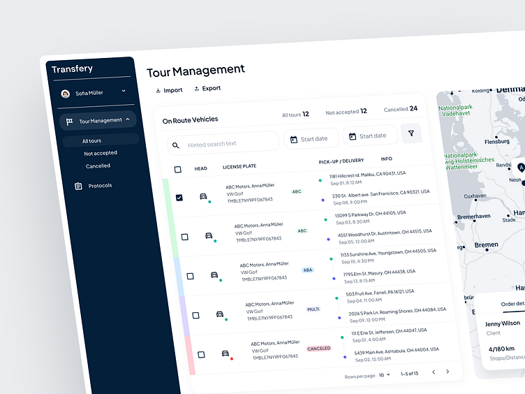
Transfery – A Seamless Tour Management Experience
We're thrilled to showcase our latest case in logistics UX/UI design: Transfery, a platform designed to streamline the intricacies of tour management. Our approach focused on delivering clarity and efficiency, balancing aesthetic appeal with functionality.
🔍 Feature Highlights:
A clean, intuitive dashboard that simplifies tour tracking, from 'All Tours' to 'Cancelled', making status checks a breeze.
An intelligent search function ensures users find vehicle details swiftly and a sophisticated filtering system for managing tours efficiently.
Interactive maps integrated for real-time route planning and tracking, offering a macro to micro perspective of tour progress.
A detailed, responsive layout adapts smoothly across devices, ensuring a consistent user experience from desktop to mobile.
Customizable widgets and proactive notifications to keep all stakeholders informed and engaged.
🎨 Design Philosophy: Our design ethos was guided by the principle of 'less is more'. We employed a minimalist color scheme to enhance usability, coupled with deliberate typography that promotes readability. Each element was crafted to convey information hierarchically, optimizing the user's journey through the app.
💡 The Outcome: Transfery stands as a testament to the power of thoughtful design in transforming complex systems into user-friendly applications. It represents our commitment to elevating user experiences through design that speaks simplicity and sophistication.
We'd love to hear your thoughts and invite you to explore the fluidity and precision of Transfery's UX/UI.
Have a project in mind? Feel free to contact us hi@theash.design


