SpringValley - Protein Bars - Packaging
Brief
SpringValley is a new brand of protein bars that emphasizes the use of natural ingredients to enrich people's daily lives. The project was a brief design sprint that lasted for 7 days, with the objective of developing the packaging design for this new product.
Persona
For this sprint, I created a persona to narrow down my designs. I focused on the athletics and healthy food communities.
Steven and Jane Ike
Age range: 18-26
Health Focused, Athlete
Interests: Competition Oriented, Eating Healthy, Nature Focused
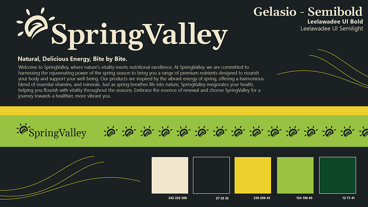
Branding
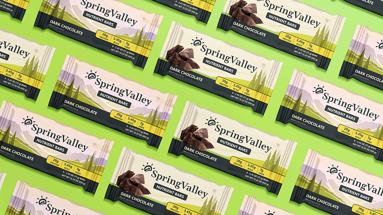
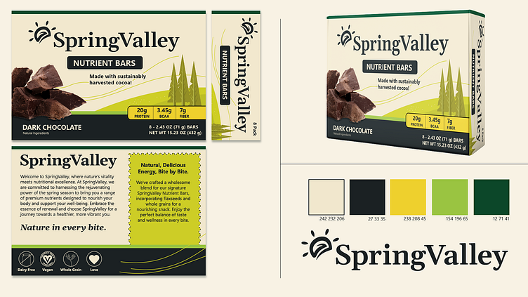
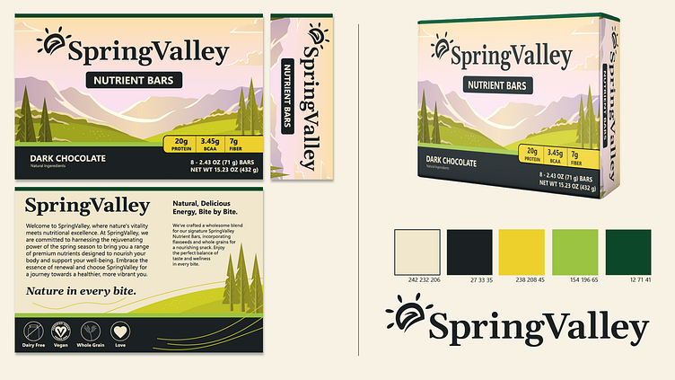
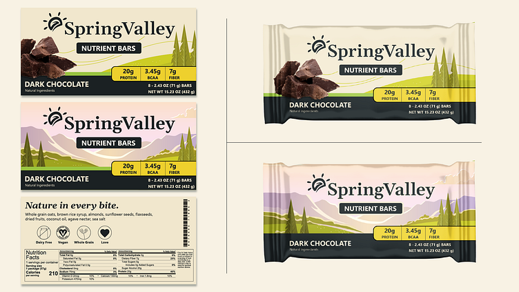
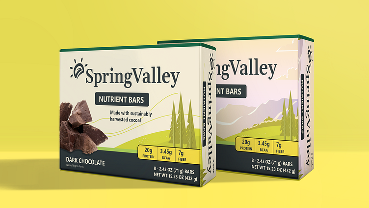
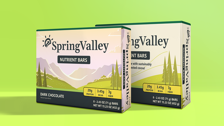
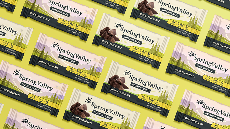
For the branding, my main focus was on our connection to nature. To achieve this, I opted for natural colors. I also wanted to experiment with an illustrative approach similar to Cliff Bars. Furthermore, I explored a packaging theme that is more in line with current trends.

Challenges
The most challenging part of this design sprint was combining the branding with different bar flavors that are not represented in the brands main color scheme. (Example using yellows to represent banana and lime flavors, etc.)
I found that modern packaging designs often showcase the flavor and appearance of the protein bars themselves. It was a struggle to balance the green color scheme with the flavor "dark chocolate". However, in the end, I felt like I captured the original vision of the brand. Nonetheless, the packaging may not effectively communicate the contents of the bars.
