Smartfood — Chain of restaurants
ATTENTION! This project will make you hungry!
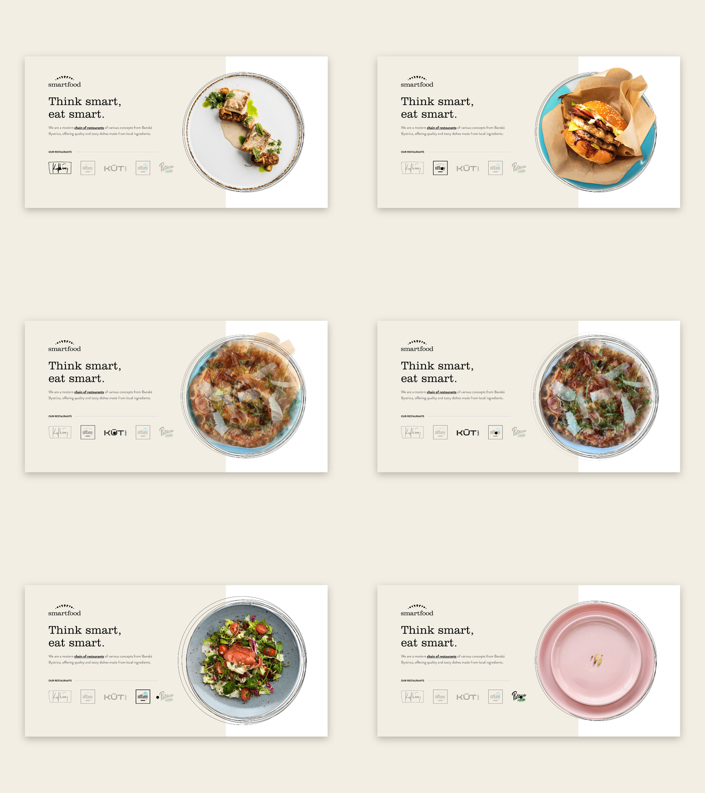
Creating different brand identities for restaurants with various concepts, while maintaining a cohesive overall brand identity was a significant challenge. Our goal was to create sub-brands that were distinctive, memorable, and complemented the Smartfood brand.
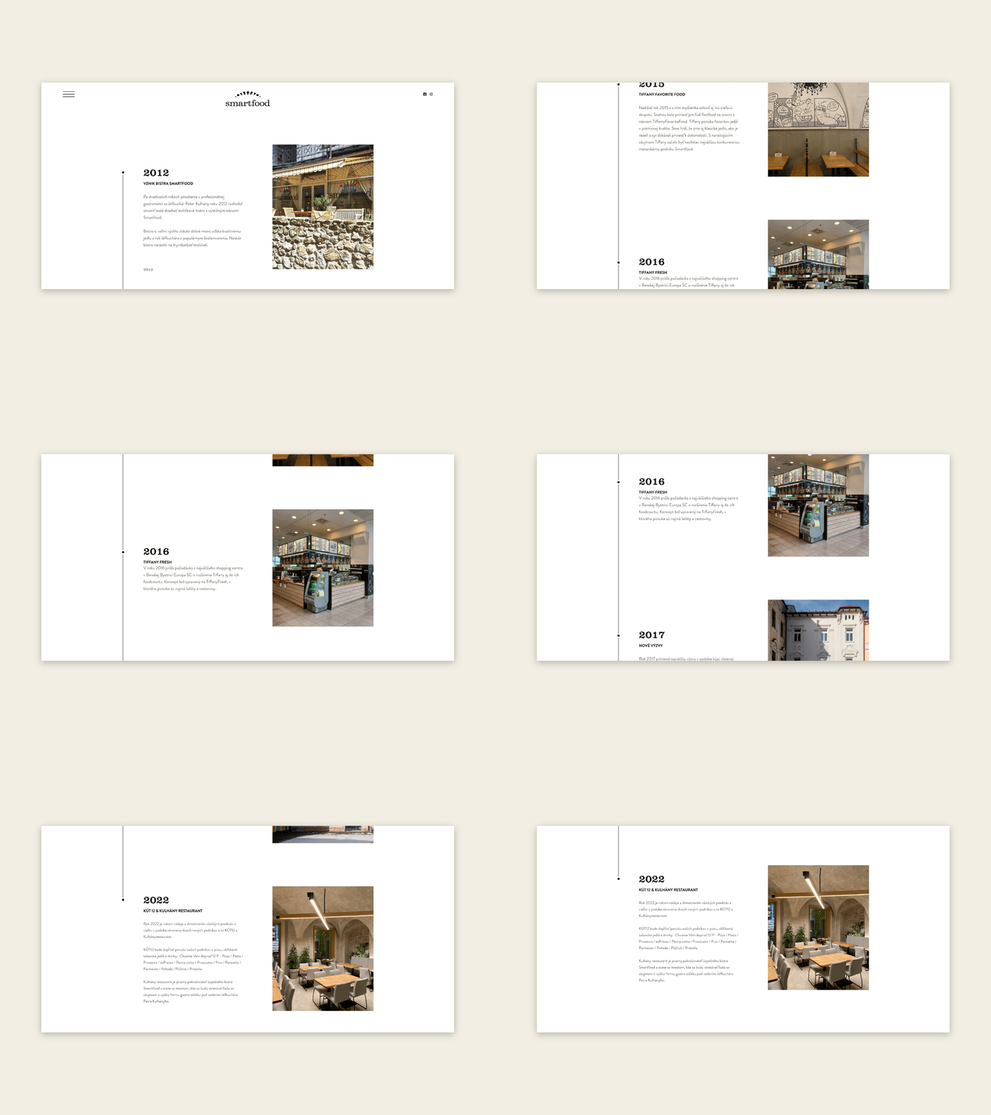
We designed a simple and effective website that provides all the necessary information for each restaurant while being easy to navigate on both desktop and mobile devices.
Our team focused on creating a user-friendly experience that is intuitive and straightforward, allowing visitors to quickly find the information they need. The website is designed to be easy to update, ensuring that the latest information is always available to customers.
Kulhány
Designing a logo for a restaurant concept that bears the owner’s name. The goal of the restaurant is to provide high-quality and diverse lunches as well as exceptional dinner events at an elevated level.
In the kitchen, tweezers are used more frequently than wooden spoons, resulting in visually appealing and aesthetically pleasing dishes that aim to delight the senses.
Tiffany
Tiffany is a high-end fast-food restaurant located in the heart of the city’s historic center, offering premium quality food favorites. The restaurant takes classic dishes such as schnitzel and cheese to new heights of perfection, carefully selecting the best local suppliers for its ingredients.
KÚT12
KÚT12 is a restaurant located in the lower corner of the historic center, offering daily pleasures in an exceptional setting. With twelve unique reasons to experience well-being, KÚT12 promises a one-of-a-kind dining experience.
To help enhance the overall brand experience, we were tasked with creating all of the stationary items used in the restaurant, including menus, t-shirts, and special promotions.
Pistácia
Pistácia, the youngest restaurant in the chain, is a vegetarian/vegan bistro with a unique goal – to attract both vegetarians/vegans and meat-eaters alike.
By creating a brand that is both bold and modern, we were able to convey Pistácia’s unique selling points in a way that is both approachable and engaging.
Our focus was on using bold colors and typography to capture the essence of the brand, while still appealing to a wide range of potential customers.


