Metro - Fintech Branding Design Story
Introducing Metro, the modern, youthful, and trusted global partner for secure payment services. Tailored for individuals in pursuit of secure and efficient financial payment solutions worldwide.
The branding for Metro was meticulously crafted to establish a visual identity that aligns with their core values and vision.
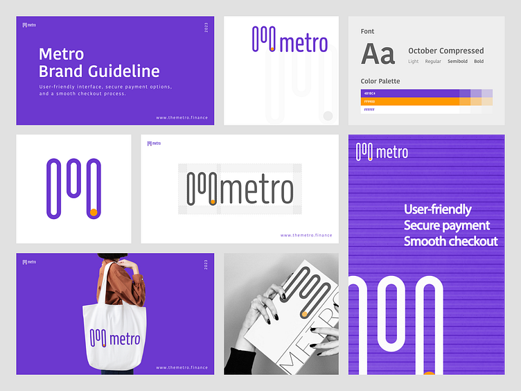
We opted for a vibrant and energetic color palette, effectively conveying the essence of modernity and youthfulness.
Logo Design:
We have crafted a logo that captures the essence of Metro: a stylized "M" symbolizing the connectivity of global money transfers and payments.
It seamlessly complements the brand's color palette.
Marketing Materials:
We have also crafted various marketing assets for Metro, including banners, posters, and social media posts.
These assets highlight the benefits and features of Metro, along with showcasing their dedicated customer support team.
Our aim was to establish a consistent and appealing brand image that captivates and engages potential customers.
With its design and branding expertise, MultiQoS unveils the core of your brand, turning it into a dynamic strength that achieves outstanding results.
Email Us: biz@multiqos.com


