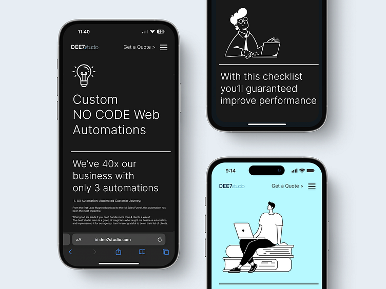
Mobile version of a B2B Website design | Dee7 Studio
Hello, Dribbble community! 🌟
We're thrilled to unveil our latest endeavor: a sleek B2B agency mobile design that harmoniously blends clean minimalism with playful line illustrations. Our goal was to craft a user experience that feels both intuitive and engaging, ensuring that every interaction is as delightful as it is efficient.
In this design, you'll notice how the subtle nuances of the line art add a layer of sophistication, while the minimalist approach keeps the interface uncluttered and user-focused. We've emphasized a harmonious color palette that complements the overall aesthetic and guides the eye naturally through the layout.
But this isn't just about looks; functionality drives this design. With businesses in mind, we've streamlined the navigation and optimized every element to ensure that professional users find what they need with ease and speed, without sacrificing visual appeal.
We're excited to hear your thoughts and feedback! Let's celebrate the fusion of simplicity and elegance, and how this combination can revolutionize B2B mobile experiences.
Cheers to more beautiful, intuitive, and functional designs! 🚀
As for the development phase, we harnessed the power of Webflow to transform our website design into a fully functional reality.
At Dee7 Studio, we offer a comprehensive package of UI & UX design solutions and Webflow development services
Let's connect at andrew@dee7studio.com
Creative Marketing Agency | FREE Website Audit Checklist | Linkedin
