Steam: UI ReDesign

This project was done in a course called Content Design for New Media, which was taught by Stina Freijd at Jönköping University.
BRIEF
This was not a project chosen by the teacher or course — rather we were allowed to choose from a few different options, I chose to do a UI reDesign of the Steam App/Website, since I know a lot of people don't love the design of it.
STEAM BRAND GUIDELINES
https://partner.steamgames.com/doc/marketing/branding
I tried to stay as consistent as I could with the current steam brand guidelines.
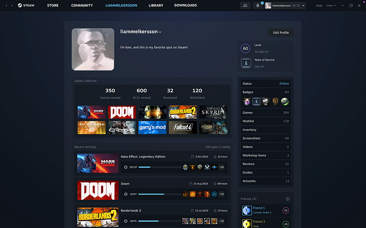
STRUCTURE
The Steam desktop app, or the Steam client, is comprised of two main components. The first part includes the native client features such as navigation, downloads, settings, and more. The second part is the Steam website, which is hosted within the Steam client to display content for various pages. This is primarily why Steam exhibits some inconsistencies, as the client is updated occasionally, but the website remains relatively unchanged and somewhat stuck in the 2010s. To address this, the idea is to merge these two components to conceal desktop-specific features when using the browser.
FONT
I don't really have an issue with the Steam font. It's their font, and it's both readable and not too cramped, so Motiva sans will do. As for the font size, I've used the exact same styles as the UI elements listed.
UI ELEMENTS
Steam's current UI resembles a mishmash of various elements. Some pages are new, while others are old. Even simple elements exhibit numerous variations throughout the platform. One striking example of this inconsistency is the Twitter icon in the footer, which hasn't received an update since 2010. Before I continue, I will create a clear and consistent list of all the elements I intend to use.
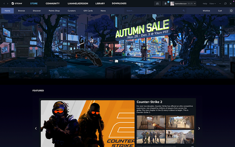
NAVIGATION
The most pressing issue with the Steam client is the chaotic placement of elements. Users struggle to locate even the most basic functions, such as redeeming a gift card within the Steam app. There are six regions with distinct options and menus, and many of these options are repetitive. For instance, "Friends and Chat" appears here, here, and here. To streamline this, I've compiled all the options from these six regions, created top-level sections, organized the options among them, and removed the redundant lower part. This way, we can eliminate the unnecessary clutter, consolidate all essential parts of Steam into one line, and place "Big Picture Mode" and "Small Mode" inside a drop-down menu to prevent accidental clicks, as very few people actually use them.