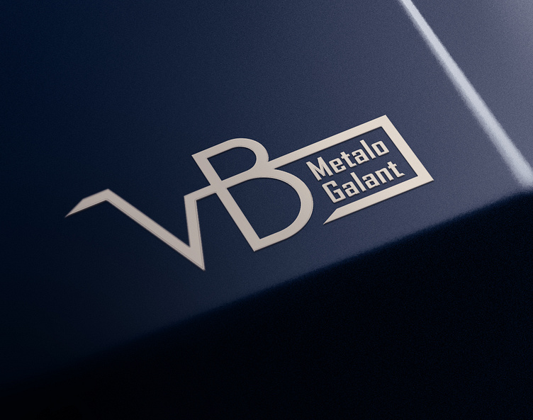
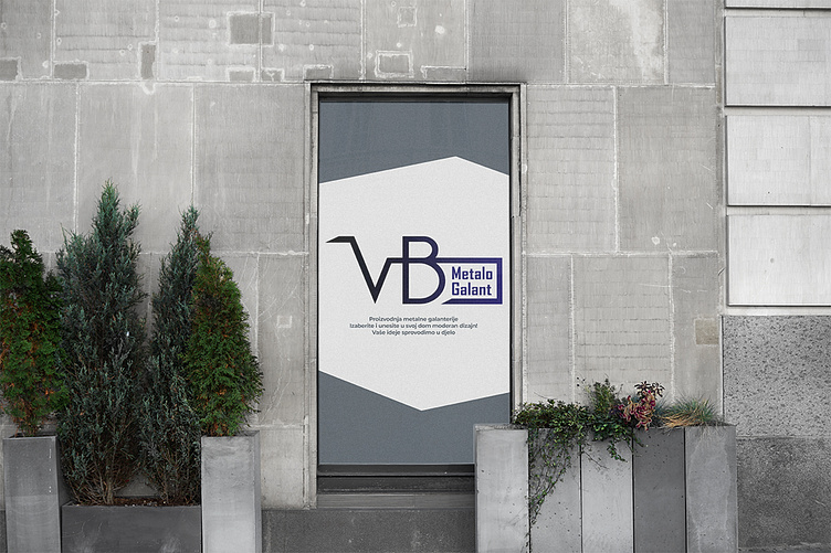
Logo design for metal workshop

First commissioned work for a client.
Client didn't have many demands, he only wanted letters VB and metalo galant to be in the logo. The main idea for the design was to use geometric shapes and sharp edges to somehow look like the metal constructions produced by the company. The colors i choosed symbolise strength, trust, precision and elegance, just as the company presents itself.
What do you think about it?Let me know in the comments