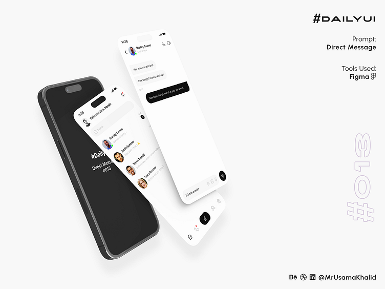
Direct Message #DailyUI
#DailyUI
Challenge #013
Prompt: Direct Message
Tools Used: Figma
Design Principles
The design of the direct message application is based on the following design principles:
Simplicity: The design is simple and easy to understand. The black-and-white color scheme creates a clean and minimalist look. The message bubbles and buttons are also black, which makes them stand out from the background.
Clarity: The design is clear and easy to navigate. The search bar is prominently displayed, and the list of chats is organized in a logical way. The status of each chat (online/offline, last message) is also clearly indicated.
Consistency: The design is consistent throughout the app. The same colors, fonts, and icons are used on all screens. This helps to create a unified and cohesive user experience.
Color Theory
The black-and-white color scheme of the app is based on the following color theory principles:
Contrast: The contrast between black and white is high, which makes the text and icons easy to read.
Versatility: Black and white are versatile colors that can be used to create a variety of different moods and styles. In this case, the black and white color scheme creates a clean, modern, and professional look.
Typography
The app uses a simple and modern font throughout. The font is easy to read and does not distract from the content of the app.
Layout
The layout of the app is simple and straightforward. The search bar is prominently displayed at the top of the main screen, and the list of chats is organized below. The status of each chat (online/offline, last message) is also clearly displayed.
Let's connect ✦✦✦
Let me know your thoughts in the comments.
I always love to receive feedback on my work!
Please share to help me promote my work!


