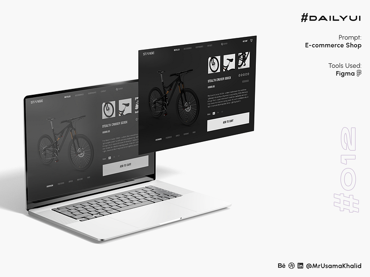
E-commerce Shop #DailyUI
#DailyUI
Challenge #012
Prompt: E-commerce Shop
Tools Used: Figma
What goes in it?
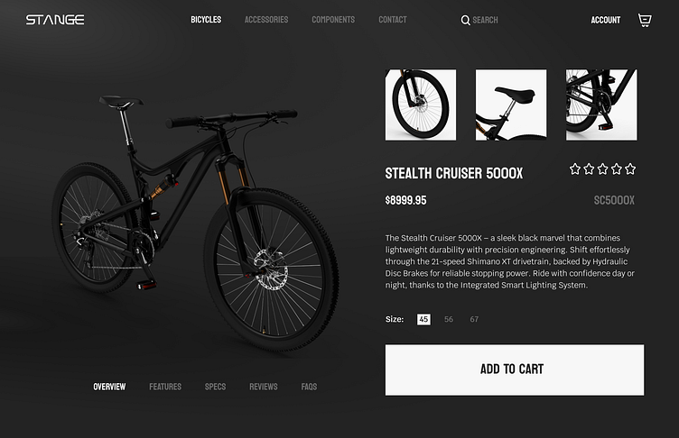
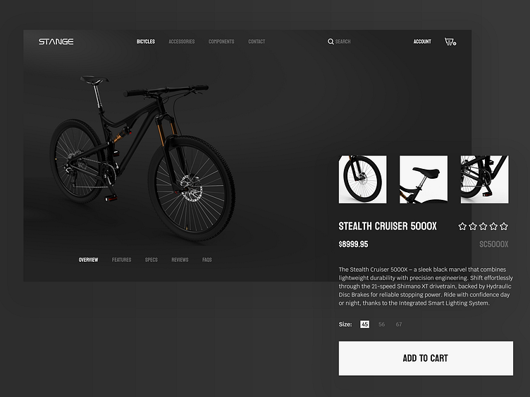
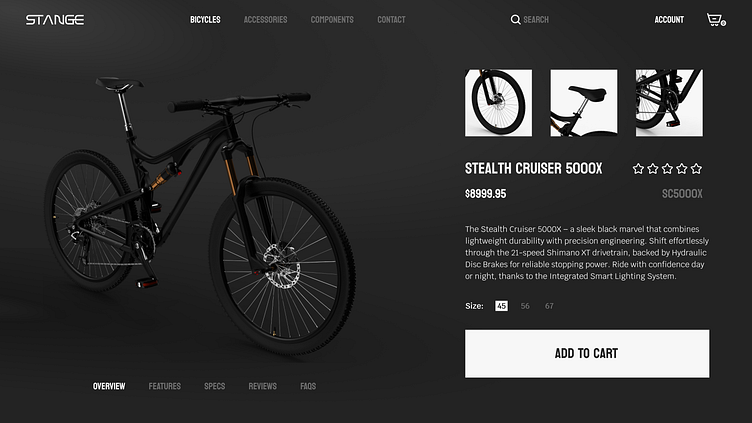
The e-commerce shop section UI design for STANGE is a simplified and soothing design with a cleaner look. The black and white theme creates a sense of sophistication and elegance, while the use of negative space helps to focus the user's attention on the product.
The design is divided into two main sections: the left side contains the product image, and the right side contains the product information, such as the name, rating, price, SKU, description, size selection, and add to cart button.
The product image is the focal point of the design, and it is given plenty of space to breathe. The image is high-quality and well-lit, and it shows the product from a variety of angles.
The product information is displayed in a clear and concise manner. The font is easy to read, and the text is well-aligned. The add-to-cart button is large and prominent, and it is easy to find.
Overall, the e-commerce shop section UI design for STANGE is a well-designed and user-friendly interface. It is simple, yet effective.
Design Theory
The design of the e-commerce shop section UI for STANGE is based on the following design principles:
Simplification: The design is simplified and to the point. There is no unnecessary clutter or distractions.
Negative space: The design uses negative space to focus the user's attention on the product.
Hierarchy: The design uses visual hierarchy to guide the user's eye. The product image is the most prominent element on the page, followed by the product information.
Clarity: The design is clear and concise. The font is easy to read, and the text is well-aligned.
Let's connect ✦✦✦
Let me know your thoughts in the comments.
I always love to receive feedback on my work!
Please share to help me promote my work!
