Taylor Trojans | Athletics Brand Identity
Taylor Trojans | Athletics Brand Identity
First established in 1846, Taylor University has been a pillar in the higher education landscape of Indiana for nearly 180 years. With such a rich history and a vision for its future, Taylor partnered with Carnegie Higher Ed on a comprehensive brand study in an effort to reimagine their brand, messaging, and ways to faithfully elevate the distinctiveness of the University.
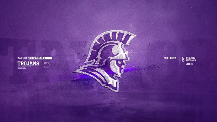
As a component of this institution-wide update, I had the opportunity to partner with Carnegie on the update of Taylor Athletics brand identity, including a revamped Trojan logo, new wordmark, and custom typeface.
Thanks for checking out the project and a HUGE thanks to Carl, Ian, & the entire Carnegie team for the opportunity to collaborate on this project!
Credits
Ian Strawn | Creative Director (Carnegie)
Carl Bannister | Art Director (Carnegie)
Jeremy Nelson | Logo & Type Design
Links
Reforging the Helm
As the centerpiece of the identity, careful consideration of each detail was taken when developing the new Trojan logo as its style and construction was informed by both historical reference and commonly recognized iconic features.
Trojans | Custom Display Typeface
Trojans is a block typeface drawn for headlines, graphics, and branded messaging. Inspired by classic collegiate block type and remixed with diagonal crossbars, the custom typeface gives Taylor a unique and functional tool for its refreshed identity.
Within the design process, a variety of type styles were explored. Some took inspiration from Greco-Roman inscription, some from contemporary athletic type, but we ultimately returned to a classic block style representing the strength and leadership of the athletes.
Rolling out in the Fall of 2022, the new Trojan logo and refreshed ID have led Taylor’s athletes through ups, downs, and hopefully to many victories ahead.
Thanks for viewing!
And thanks again to Ian, Carl, the Carnegie Team, and everyone from Taylor!


