Small Business Revamp - Dragonfly Crafts
Introduction
We found a small business in Texas that desperately needed a brand identity redesign, so I offered to do it for free!
The logo
Backstory/Inspiration
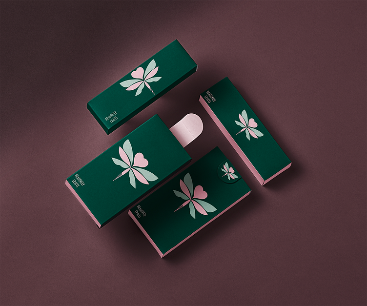
So, when I first checked out Dragonfly's logo, I really liked what they were trying to do. But, to be honest, it wasn't super clear at a glance. If they're planning to grow their brand, they've gotta tone down the complexity. That's something a lot of new brands miss. New business owners often get caught up in making their first logo really detailed and complex. What I wanted to do with their logo was make it simpler and more recognizable. I aimed to create something that anyone could sketch out in 5 to 10 minutes. It also should be easy to spot and understand, whether it's up on a huge billboard or just on a small shipping label
Next Up: The Colors
Colors were surprisingly the hardest thing to pick for this brand. Since it's a woman-owned business, I really wanted the colors to have this 'Mother Nature' aesthetic. So, I went with mainly natural greens and threw in a bit of slightly tinted pink. The idea was to mix in a feminine touch with an outdoorsy feel. It's kind of like bringing the beauty of nature into the brand's look
Lastly: The Name
One Crafty Dragonfly Vs Dragonfly Crafts
So, about changing the brand name from 'One Crafty Dragonfly' to 'Dragonfly Crafts', Well, the reason is pretty straightforward. The original name, while catchy, isn't exactly SEO-friendly. Imagine this: even if a loyal customer totally loves 'One Crafty Dragonfly's' stuff and tells someone about it, by the time that new potential customer starts typing the name into Google, they're probably already heading out of their office or leaving the coffee shop. It's a bit of a mouthful, Simplifying the name to 'Dragonfly Crafts' makes it way easier for new people to find the company/brand. They can just quickly type it in, and Google will probably even autofill the rest. It's all about making it simple and accessible for potential new customers.
Wrapping Up
And that's a wrap! Thanks a ton for sticking with me through this little journey of rebranding and design tweaks. If you loved what you've seen and heard, don't be shy— I don't bite (much). Hit that follow button to stay in the loop with my latest projects. Got an idea or a project of your own? I'm always up for a challenge, so feel free to reach out. And hey, if you liked this post, a quick like or share would mean the entire andromeda to me. Peace Everyone
Sincerly yours, Mackota
NVRSTOP


