OpenPay Landing Page

Project Overview
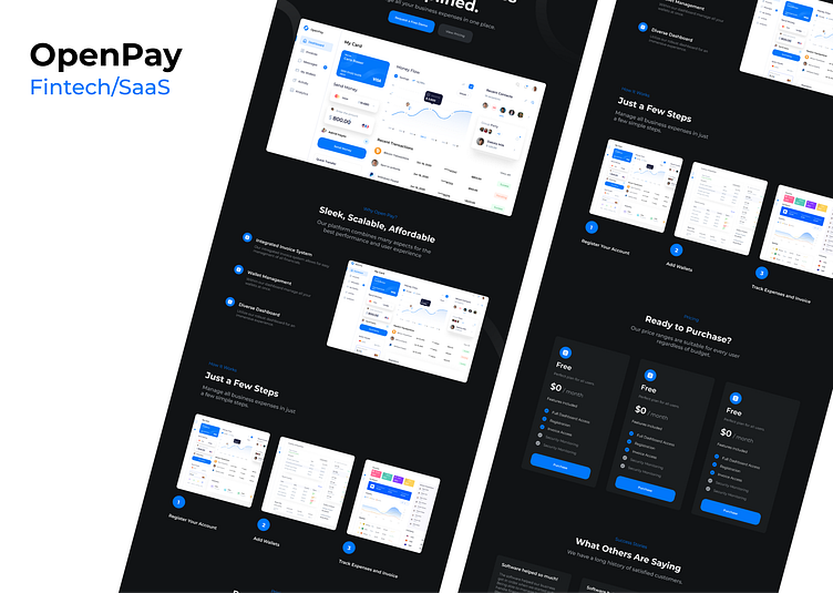
OpenPay presents itself as a sleek, scalable, and affordable financial technology
(SaaS) solution that aims to streamline the management of business expenses. The platform’s design is tailored to combine functionality with aesthetics, offering an integrated experience that caters to the needs of diverse users.
Research and Insights
The landing page design suggests a user-centric approach, focusing on simplicity and efficiency. It's likely that user research highlighted the need for a clear, accessible tool that could handle multiple financial tasks seamlessly, leading to an interface that prioritizes ease of navigation and information availability.
Design Principles and Guidelines
Adhering to modern design principles, OpenPay uses a clean, organized layout with a dark theme that enhances readability and provides a contemporary look. The use of blue accents signifies trust and security, which are crucial in fintech applications.
Color, Typography, and Aesthetics
The design employs a monochromatic color scheme with shades of blue to denote different features and functions, creating a visually cohesive experience. The sans-serif typography is modern and readable, reinforcing the app's data-driven nature
Layout and Structure
Information hierarchy is well established, with the most critical actions and features (like 'Request a Free Demo' and 'View Pricing') positioned prominently. The step-by-step guide on how the service works offers a quick understanding for prospective users.