RoomMe Mobile App Design

Behind the Design
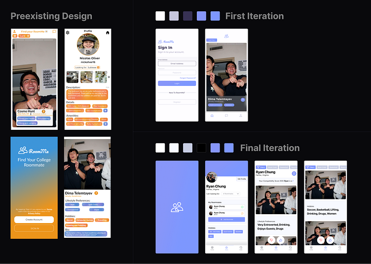
The RoomMe mobile application underwent a significant transformation from a quick, Tinder-style swiping interface to a more detailed, Hinge-like profile presentation. This strategic pivot was driven by the desire to offer users a comprehensive understanding of potential roommates, prioritizing depth of information over speed of interaction.
Research and Insights
Initial user feedback suggested that making a decision about a potential roommate required more than just a quick glance. Users wanted to make informed choices based on a range of details, leading to the redesign that allowed for expanded profiles.
Design Principles and Guidelines
The redesign adhered to principles of user-centricity and clarity. By providing more information at first glance, the app aimed to minimize user effort while maximizing the value obtained from each profile viewed.
Color, Typography, and Aesthetics
The color palette evolved from bright and high-contrast to more muted tones, suggesting a shift towards a serious and informative tone. The typography remained clean, aiding readability for the increased amount of text.
Layout and Structure
In the final iteration, the layout was reorganized to present information in a hierarchical manner, with the most critical details (name, photo, preferences) prominently displayed. This structure facilitates a quick overview while inviting users to delve deeper into the profile.