Elegance Unveiled: Main Frame Gallery's Luxury Branding Odyssey
In the heart of artistic expression, a masterpiece was unfolding – the luxurious rebranding of Main Frame Gallery, a sanctuary where creativity met sophistication. Here begins the tale of a gallery reimagined, where each stroke of the brush and every frame on the wall told a story of opulence.
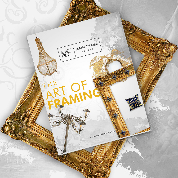
Gilded Elegance: The color palette chosen to grace Main Frame Gallery was nothing short of a symphony of sophistication. A blend of deep onyx and gilded gold graced the brand, casting an ambiance of regality upon the space. It was a visual ode to the timeless beauty that resonates within the walls of the gallery.
A Regal Emblem: At the heart of this rebirth stood an emblem of regality – a mainframe adorned with intricate golden details. This symbol not only echoed the name but stood as a testament to the gallery's commitment to being the central nexus of artistic brilliance.
Canvas of Luxury: The UI design of Main Frame Gallery's digital presence became a canvas of luxury in itself. Visitors to the website were greeted with a virtual experience that mirrored the ambiance of a high-end art gallery. Navigating through the online exhibits was a seamless journey, with every click echoing the opening of a door to a private collection.
Exclusive Collections: Each art piece housed within the gallery was curated with precision, forming exclusive collections that transcended mere displays. The UI design ensured that visitors could not only view but immerse themselves in the narrative behind each creation, a journey into the minds of artists and their masterpieces.
Interactive Excellence: Interactive touchpoints were strategically placed, allowing patrons to engage with the artwork on a deeper level. From virtual walkthroughs of physical exhibits to augmented reality experiences, the website's UI design created a bridge between the tangible and the digital, offering an immersive encounter with art.
Ephemeral Exhibitions: The concept of temporal exhibitions was introduced, creating an air of exclusivity around featured artists. The UI design echoed this by employing dynamic layouts that shifted with each exhibition, mirroring the transient nature of high-profile showcases.
Private Viewing Experience: An exclusive member's area was crafted, offering a private viewing experience to patrons who sought a more intimate connection with the art. The UI design of this space exuded sophistication, providing a virtual sanctum for art connoisseurs to explore hidden gems.
Artistry in Every Detail: From the golden filigree in the logo to the curated collections and the virtual ambiance, Main Frame Gallery's luxury branding became an embodiment of artistry in every detail. It stood not just as a space for art but as a haven for those who appreciated the intersection of luxury and creativity.
And so, Main Frame Gallery's journey into luxury branding became a testament to the idea that an art gallery is not just a space to display creations; it is an immersive experience, a convergence of luxury and artistic brilliance.
